10 Best Donation Form Examples to Improve Your Giving Experience
Donation forms are proven ways to fundraise for your nonprofit. This guide with handpicked examples of successful donation forms will help you create your own today!

Donation forms are proven ways to fundraise for your nonprofit. This guide with handpicked examples of successful donation forms will help you create your own today!

A confusing or shoddy donation form can discourage donations faster than anything else. Donation forms must provide a reason to give, make it easy and quick to donate, and collect enough information to reach donors again.
Nonprofits must take the time to perfect their form’s branding, content, and technical details. In this article, we’ve curated some of the best examples of donation forms to inspire you to create a good one for your organization. Additionally, we’ve added 5 tips to help you improve your giving experience with the donation form.
10 Best Donation Form Examples –
Bonus – 5 Tips to Create a Donation Form that Improves Giving Experience

The following donation form examples for nonprofits stand out for their quality and creativity.
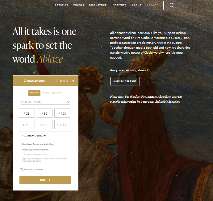
Word on Fire’s donation form has a simple interface that instantly makes the giving process look hassle-free to potential donors.
Create an Embeddable Donation Form
Let’s see what aspects of this donation form stand out –
Word on Fire has used Donorbox to create and customize this donation form. Donorbox lets nonprofits create recurring donation forms and embed them in their websites or use them as popup forms. The process is simple – one just needs to copy and paste the code into their website editor to get started.
While we love their donation form, we also appreciate the beautiful design of the page that accentuates the overall look and feel. This has surely made it easy for the form to grab the eyes of people and inspire more donations.
She’s the First donation form stands out because of its simplicity and the vast amount of information it collects. This donation form also gives donors several financial, program, and communication options. The variety of choices offers donors more control over where their gifts go within the organization.
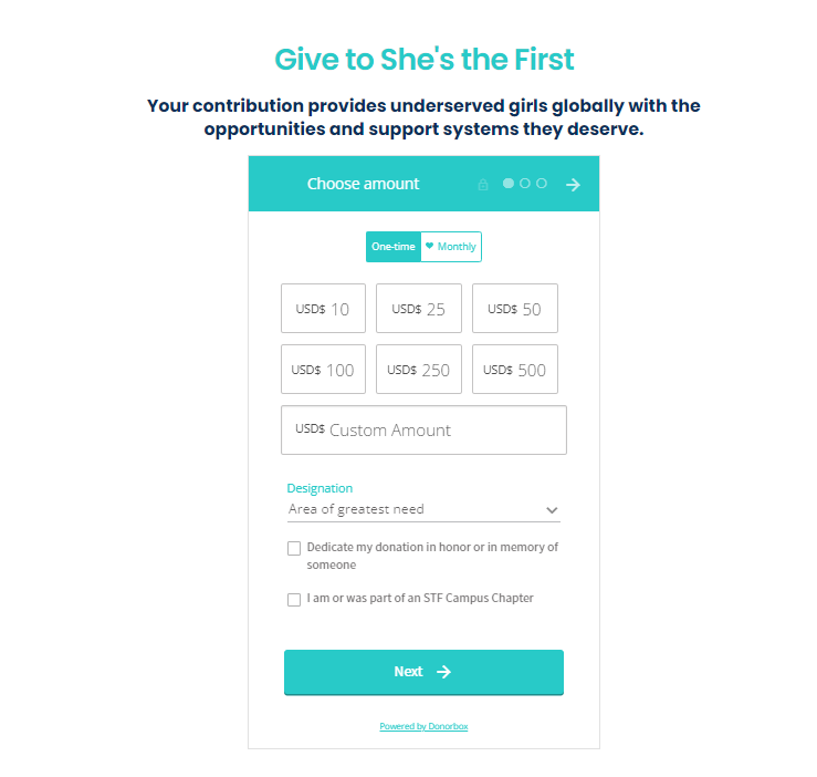
Here is what we love about this donation form –
She’s the First’s Donorbox donation form also provides more ways to target its donors. They accumulate biographical information via the form. They also ask donors about their interest in their organization, if they are part of an STF Campus Chapter, and how the donor heard about them.
The option to honor or memorialize a family member or friend allows the nonprofit to add more connections to its donor database. She’s the First finally asks donors to subscribe to their mailing list. It helps them build and strengthen donor relationships through communication.
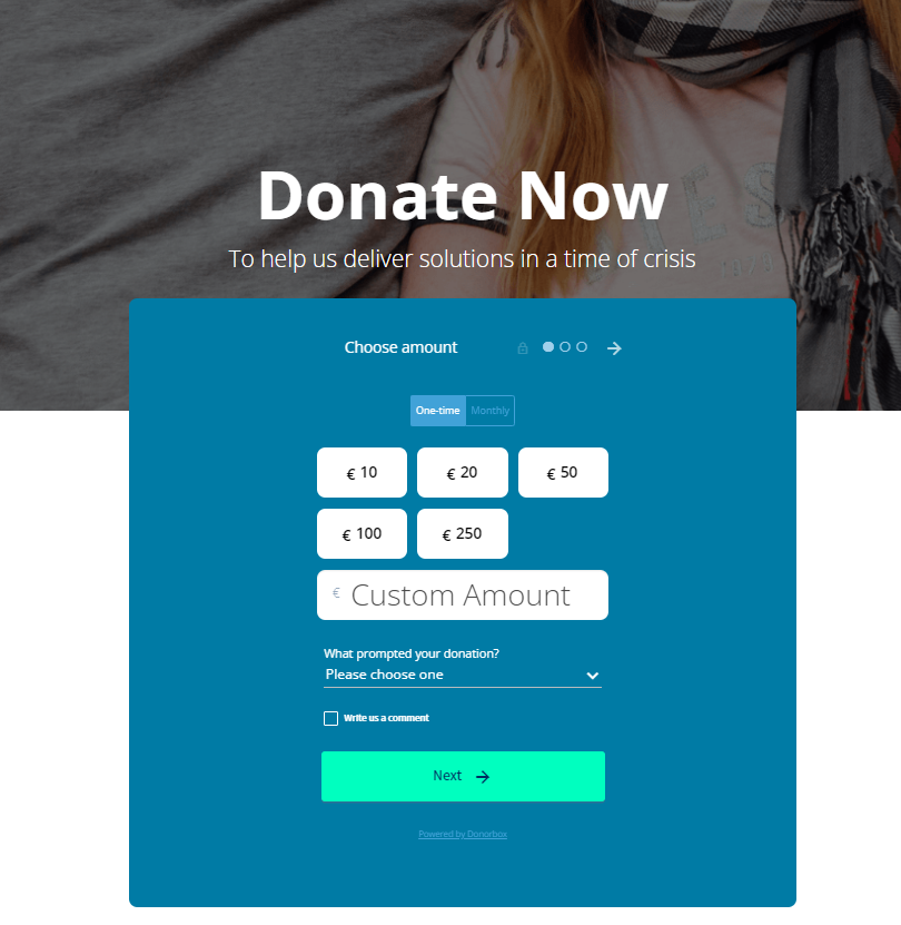
Peter McVerry Trust’s donation form stands out immediately because of how well it’s integrated into their website. The donation form shares the same color as their logo, and the layout helps assure donors that they’re still on their website. This successful integration ensures that donors have trust in the nonprofit.
They have customized this Donorbox donation form using a custom CSS technique. While Donorbox forms are anyway customizable for brand color and additional questions, this custom CSS option further lets nonprofits make this form their own.
Create a Customized Donation Form
Another thing that stands out on this donation form is the question they ask donors about what prompted their donation. By asking this right away, donors feel the nonprofit wants to learn more about them. The choices provided can also be used to send targeted communication in the future –
Peter McVerry Trust carries this through to the second page of their donation form when they ask donors to choose the best way to send them updates.
This nonprofit clearly sees donations as the first step in building relationships with its supporters.
Maya’s Hope works to improve the quality of life of orphaned, impoverished, and special-needs children on a global scale. When donors open their donation page and before the form pops out, the first thing they see is how close the organization is to meeting its $1,000,000 goal.
Donors are just like everyone else. Fear of missing out remains one of the main reasons donors give. So by sharing the number of donations and the amount raised above the donation form, you make donors desire to be part of it.
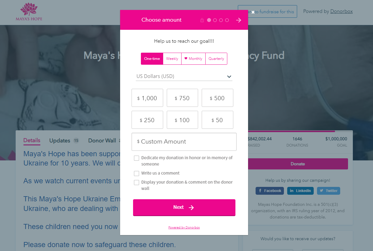
Here are a few things about this donation form that stands out –
Along with the form, this organization also stands out because of its focus on peer-to-peer campaigning. Any of their supporters can choose to fundraise for them by clicking on the button at the top of the page.
Nomi Network is on this list for a simple reason that too many nonprofits forget to include. This organization gives donors the possible impact of their donations right away.
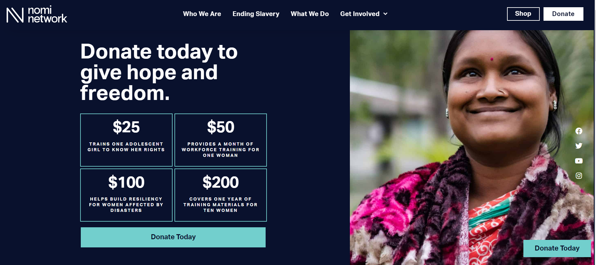
Nonprofits don’t have to work too hard to provide this information. Their years of creating impact and relevant experience should help them include these details in the donation form. The above form is a customized design that only includes the donation amounts. When donors click on any of these amounts, they’re taken to the Donorbox donation form where they complete the donation.
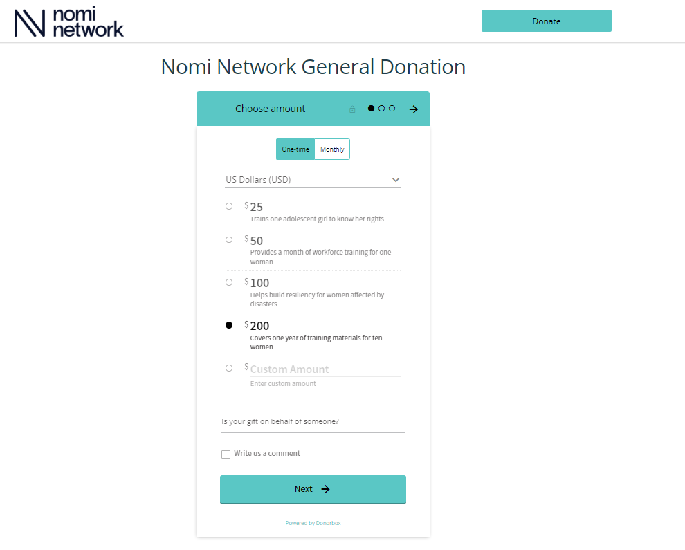
Nomi Network also collects donor information they can use in future campaigns and communication. Here’s how they do it –
Charity: Water is one of the best nonprofits out there at marketing. Their donation forms are no different. 2022 is Charity: Water’s 16th anniversary and they have been creative in highlighting this fact. The nonprofit has done an excellent job asking its supporters to donate $16 monthly for their 16th birthday.
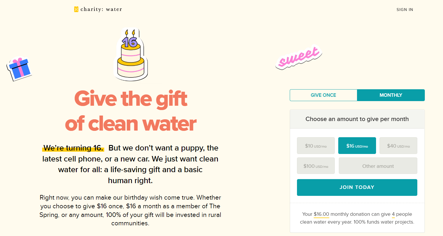
Charity: Water’s donation form is embedded into its donation page and inspires trust in its donors. They’re also transparent in how donor financial information is saved and how easy it is to donate again in the future. This transparency once again drives more trust.
We also love the express donate option on their donation form that lets people quickly complete a donation. Options like this are great for reducing donor drop-off rates.
Heifer International’s donation form is aesthetically pleasing to the eyes. People react strongly to visuals and this form makes the most of this fact. Potential donors visiting the donation page would be able to see where their donations would be going if they chose an option.
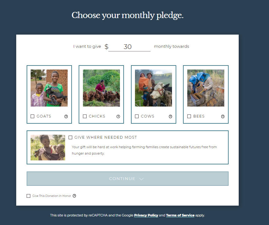
Embedding its donation form into the donation page allows Heifer International to gain the interest and trust of its donors. As the donor fills out the donation form, they can also read how their gift makes a difference in the organization.
From the beginning, they clarify how donors can help and make giving fun by letting people choose goats, chicks, cows, bees, or where it’s needed most.
The primary reason PARC National Des Virunga’s donation form is on this list is because of branding. PARC has embedded the donation form on its donation page and uses the same colors as its logo. When donors aren’t transferred to a different website, they generally trust their gifts will go to the right place, so this inclusion is important.
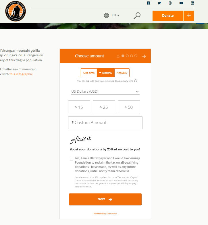
In addition, there are a couple of other aspects that we love about this donation form including –
While we love the donation form and its branding, we’d have loved it more had they embedded it right on the hero image on the donation page. It makes it easier for people to locate the form on the page.
Empower Work has embedded a simple, branded, and recurring donation form on its website. We love the amount of customization they’ve utilized for this simple design.
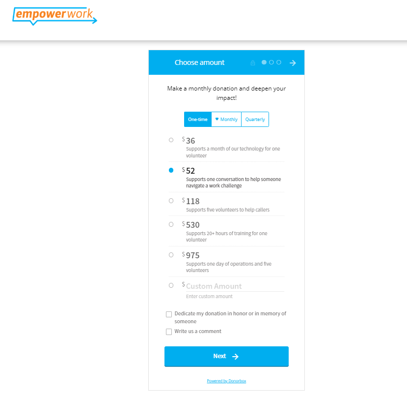
There are a few reasons why this form has made it to this list –
Supporters of this nonprofit can give using Google Pay, credit cards, as well as the bank transfer method via this donation form. They also have the option to cover processing fees so the nonprofit gets to keep all the donation money.
The World Wildlife Fund is another organization that does an excellent job sticking with its branding by embedding the form into its donation page.
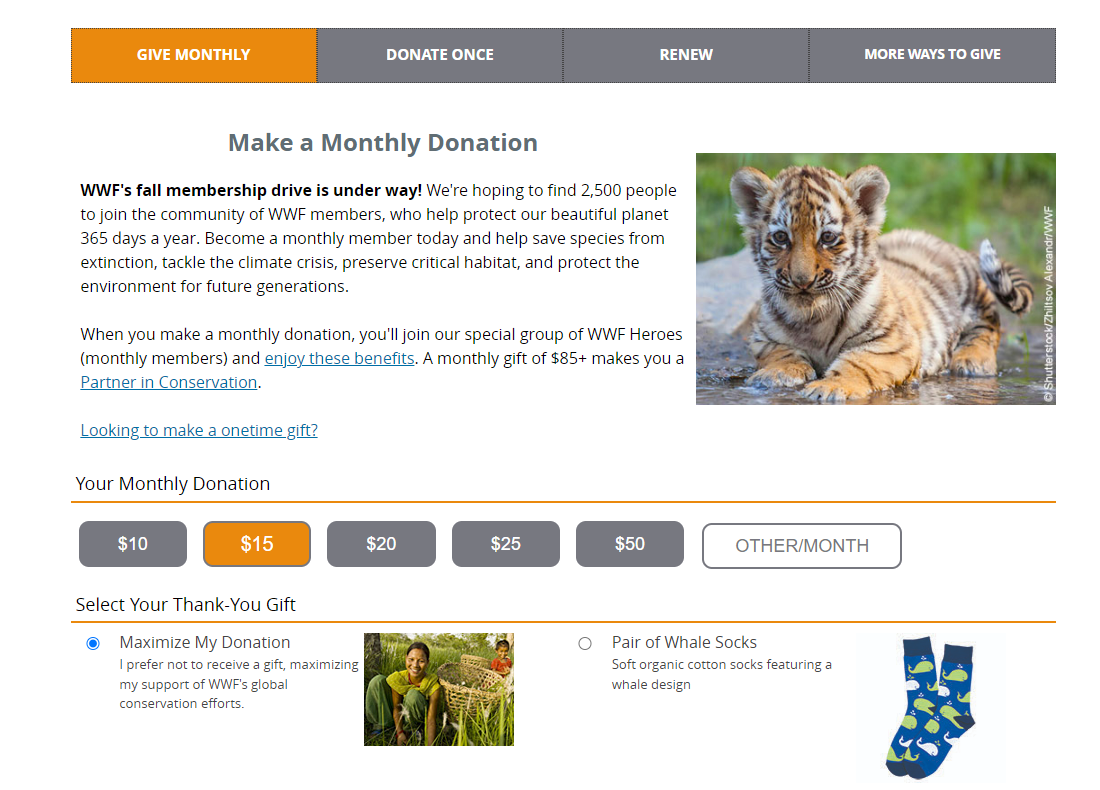
This nonprofit lets donors choose to give monthly, donate once, renew, or provide more ways to give. These options help keep donors on the same page. If the donor chooses to donate once, they can choose between several amounts.
Donors can also decide to cover the nonprofit’s processing fees. World Wildlife Fund explains that by covering these fees, the donors’ gifts go to the nonprofit, not the credit card processor.
Donors can then enter their contact and financial information to finalize the donation on the same page. World Wildlife Fund’s seamless donation form allows people to make a quick donation and remain connected to the organization through images and branding.
Now that you’ve seen what other nonprofits are doing, here are a few things you can include on your donation form.
Donors must trust a nonprofit before giving. Donation form examples on this list showed two ways to establish this trust.
One way is to add branding such as appropriate colors to the form and logo to the donation page if it is hosted outside of the website. Also, it is advisable to embed the donation form in the nonprofit website so people don’t have to navigate away from it.
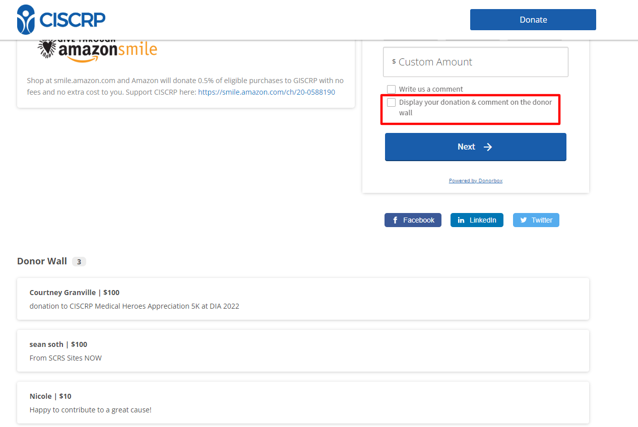
Testimonials from donors can also establish trust. Donorbox lets nonprofits easily add a donor wall to the donation page and also embed it on their website. All you need to do is activate this feature and ask donors if they’d like their donations and comments to be added to the donor wall, as shown below.
Urgency is another vital element to include on your donation form. Nonprofits can add urgency to fundraising campaigns through programs or immediate needs.
They can also create external coercion by adding a matching gift component. If you have a major donor or sponsor, ask them to donate a significant amount. Use that amount to encourage donors to give and double their donation.
Donorbox partners with Double the Donation to let nonprofits add a donation matching widget to the donation form. This helps donors check if their employers would match their donations. The whole process is hassle-free and lets nonprofits double/triple donations. Here’s how one of the nonprofits is using this feature on Donorbox.
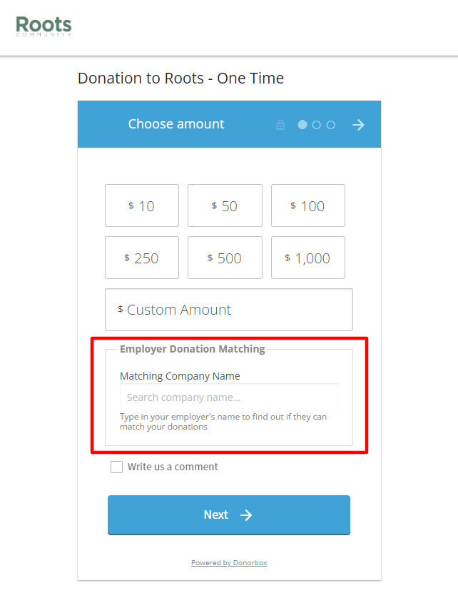
Another way to promote urgency is to add a donation thermometer to the donation page right above the form to give a visual enticement to donors.
The primary way to encourage donations is by showing why they should give. There are several ways your nonprofit can do this. One is by telling a compelling story of a beneficiary. Telling the tale of one person is more impactful than data about large groups of people you’ve helped.
People are hard-wired to pay attention to stories, and by adding one to your donation page, you can make the donor feel a greater connection to the organization and those you help.
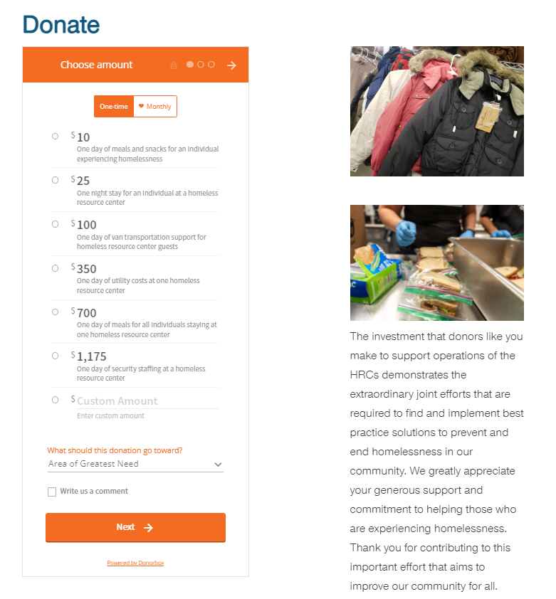
Another simple way to show why donors should give is to provide details on how each donation amount is used. For instance, $100 can send one child to school for a year. Through this, donors can connect their gifts to real-world impact.
Here’s an example to show you how it works. Look at each impact description under the donation amounts, that’s sure to give people a reason to give.
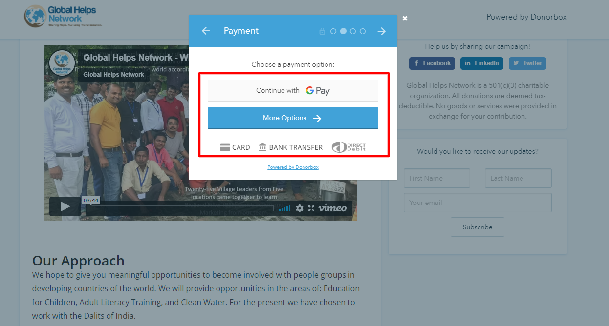
The best donation forms also give donors several ways to give. Include options like digital wallet payment methods to make the younger generations feel comfortable about giving. Add Venmo, Apple Pay, Google Pay, PayPal, etc. to your donation form in addition to card payments and bank transfers.
The idea is to make giving simple and quick for all kinds of people. No one person should leave midway through the process thinking your giving process is outdated. Check this example out –
Make it Easy to Give with Donorbox
Of course, you should collect donor information to be able to connect with them later. But also, you should never make your form lengthy by adding too many fields and questions. The moment donors see that they have to type in a lot of information, they tend to leave the form midway.
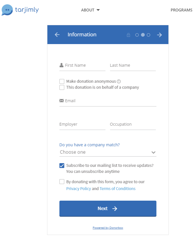
Add only necessary questions such as one’s name, phone number, and email address – that’s it. Later as you connect with them via phone or email address, you can gather more information.
When donors start the donation process, they want to be able to be done as soon as possible. Make it happen for them. We love what Tarjimly does to keep their “Information” step neat and compact with just the right questions and fields.
Donation forms are the last thing donors see before giving, so you must make it an easy and inspiring experience. The donation forms listed in this article do an excellent job conveying urgency, establishing trust, and making it impactful and easy to give.
As you’ve seen in some of the above examples, Donorbox donation forms are highly customizable which makes them easily blend into your website’s look and feel. It doesn’t take much effort either – just a couple of switches to toggle and checkboxes to check. That’s it. Further, you can embed these forms into your website with a simple copy-paste code from Donorbox. There’s no hassle, no start-up fee, and no monthly costs – just sign up and get started in about 15 minutes from now!
Here’s a quick, demo video to help you get started with Donorbox in 4 simple steps.
Explore insightful blogs on fundraising, donor management, starting a nonprofit, nonprofit management, and more on the Donorbox Nonprofit Blog. Our newsletter includes a hand-picked list of the best Donorbox resources including webinars, podcast episodes, product updates, blogs, and more. Subscribe to receive it in your inbox every month.
Learn more about Donorbox and its simple-to-use features on the website. For any queries, reach out to our support team. They’d be glad to help!

Subscribe to our e-newsletter to receive the latest blogs, news, and more in your inbox.

