9 Actionable Tips to Improve Your Nonprofit’s Website Copy (+30 Examples)
Many nonprofit websites have tons of words on the page and yet fail to express themselves in a clear, engaging, user-friendly way. Maybe the site is easy to understand but feels flat and robotic. Or maybe it’s full of personality and charm, but it’s utterly mind-boggling to navigate. Sounds familiar? Then I’m glad you’re here!…
Many nonprofit websites have tons of words on the page and yet fail to express themselves in a clear, engaging, user-friendly way. Maybe the site is easy to understand but feels flat and robotic. Or maybe it’s full of personality and charm, but it’s utterly mind-boggling to navigate.
Sounds familiar?
Then I’m glad you’re here! Below, I’m sharing 9 practical tips you can use to improve your nonprofit website copy, including super-quick fixes you can do now (like, right now!).
Before we dive in, let me go ahead and say that some of those absolute must-have writing tips you see everywhere? I don’t buy ‘em.
Removing “passive voice” does not necessarily make your copy better. Having at least THREE SENTENCES per paragraph does not necessarily make your copy better. Here’s what does:
A lot of people think that website copy has to be short at all costs and thus end up cutting critical, information-rich words just for the sake of brevity. But that maxim that “people don’t read” really isn’t true!
People do read—but only what they care about.
According to the Nielsen-Norman Group (pioneers of user experience), 79% of all website visitors scan a new page before reading it. And only 16% ever read the whole thing line by line.
The takeaway: Your website visitors should be able to quickly scan any page, read what they want to, and skip what they don’t.
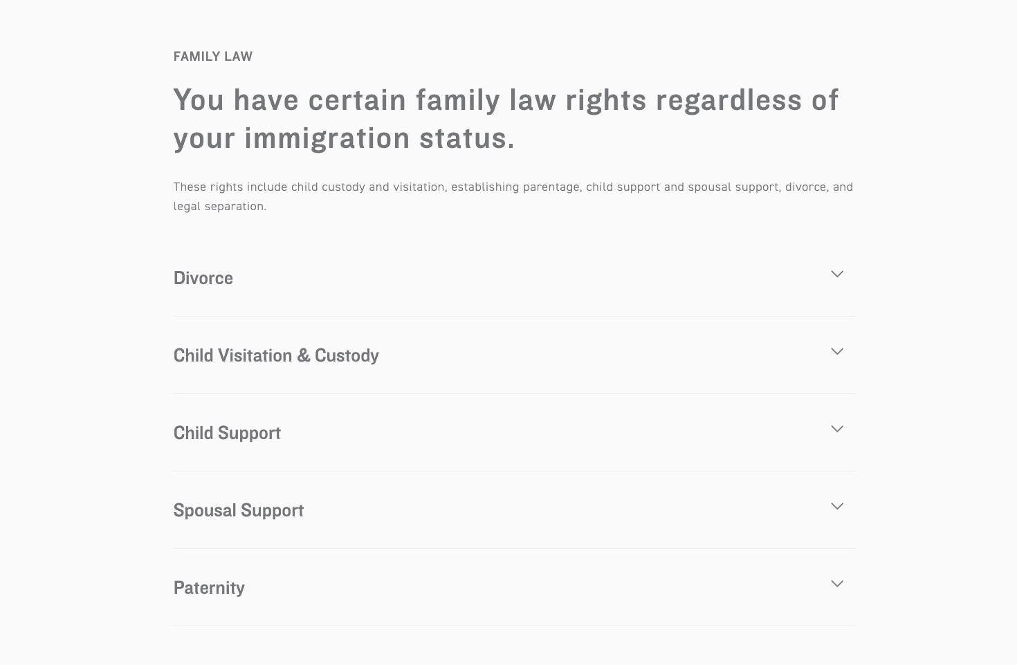
Pro tip: Headers significantly improve scannability, and 9 times out of 10, nonprofit websites don’t have enough. So add more!
Examples of Headers in Action
1. Peace Over Violence does a great job of using headers, even going so far as hiding the paragraph text to keep the page simple and clean.
2. OneGoal is another awesome example, using multiple levels of headers that are imminently scannable.
2. Make Your “Hero” More Captivating
What’s the first thing a visitor sees on your website?
Speaking of headers…
The most critical headline on your entire website is likely the one at the top of your homepage (the area that’s often called “the hero”). Academic research shows that website users form a first impression in just 180 milliseconds, so your homepage hero had better make a resounding impression!
In fact, if you only improve one header on your whole nonprofit website, make it this one.
In a perfect world, your homepage header would:
Clearly explain what you do: You don’t necessarily have to say, “We do XYZ.” The same idea can be expressed in the form of a tagline, a snappy phrase, a powerful statement, a quote, a list of aspirations, or even a controversial stance.
Speak to your audience: This is a great place to use a strong action verb and/or the word “you”—showing website visitors that yes, you are speaking to them and, yes, they are in the right place.
Express some personality: See tip #6 below for more on this!
Examples of Awesome Heros on Nonprofit Websites
1. The Dallas Area Rape Crisis Center does a fantastic job of speaking to the audience and clearly defining their core values in their homepage hero.
2. The Environmental Working Group does it a little differently but still effectively, using a direct command to speak to the audience.
Another key header to update across your website? The one inviting visitors to join your newsletter.
Newsletters are a terrific way to nurture relationships toward your nonprofit’s goal (whether that’s more donations, volunteer engagement, brand awareness, etc.). But way too many nonprofits are missing out on sign-ups because they do not give people a reason to join.
If your newsletter sign-up header says any of these….
Join Now
Get Updates
Sign Up
Join Newsletter
Email Signup
Get Involved
Stay in Touch
Click Here (the worst offender!)
…then it’s time to change things up.
Instead of a generic phrase, you should tell users what they will get out of joining and answer the “So what?” question. So what if I sign up? What will I receive? Why should I be interested?
Use this copy to make the case for why someone should take the time to enter their email, push a button, and then confirm the subscription from their inbox. Reassure them that you will be providing something of relevance and value, not just asking for money.
Powerful Examples of Newsletter Signup Copy
1. Black AIDS Institute does an amazing job with their newsletter signup text, explaining both what you’ll get (resources by Black leaders) and why (to end HIV).
3. Lifting Hands International keeps it simple and straightforward with an image right from the field, which implies what subscribers should expect.
4. Serrv utilizes another strategy altogether via a newsletter popup. Again, they provide value (15% off) and a clear set of expectations for joining.
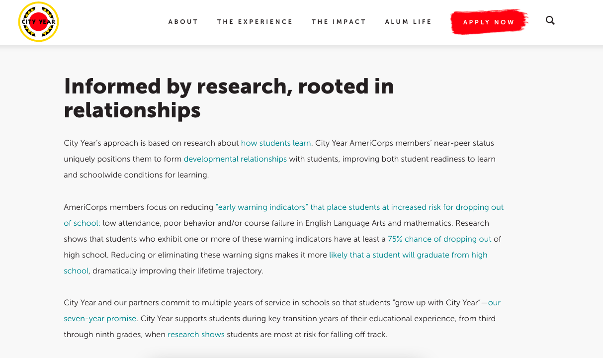
4. Shorten Your Paragraphs
Are your paragraphs short enough?
In addition to improving website headers, it’s a good idea to shorten your paragraph text. I know, I know, we all grew up hearing “a paragraph must have at least 3 sentences”—but again, totally not true.
A paragraph can be a short sentence.
A few words.
One!
Just remember the rule: people scan websites. Long paragraphs almost always feel intimidating at worst and boring at best, and most people won’t read the entire thing either way.
You can make your paragraphs shorter by:
Cutting words
Using more numbered or bulleted lists
Breaking one long paragraph into multiple paragraphs
Even deleting wordy or unnecessary paragraphs altogether!
Pro tip – You can also make the same paragraph feel shorter by making the paragraphs easier to scan.
This might entail setting the right line height (aim for 140-180% of font size), setting the right space between paragraphs (aim for 50-100% of font size), and keeping the lines narrow in width (aim for 70-80 characters per line). If you aren’t sure what these mean, here’s a user-friendly guide to web typography.
2. City Year makes sure that paragraphs are easy to read with a fairly short text, adequate line height, and plenty of space between the paragraphs.
3. Vibrant does a great job of breaking down their entire content into short, readable paragraphs with sufficient space in between.
5. Up The Clever Factor
Where can you be more clever?
This one can be hard to implement if you don’t have a writer-ly sense. But probably someone on your staff is known for clever turns of phrase, right?
Have that person shuffle through your current website copy and see where you might able to add some personality, like:
Wordplay
Puns
Rhymes
Exaggerations
Clever substitutions in well-known phrases
Unexpected twists on well-known idioms
Homonyms (the same word with multiple meanings: current as in “up-to-date” and current as in “flow of water”)
Homophones (words that sound the same but are not actually the same word: flower vs. flour)
Even little phrases can truly delight, injecting personality and achieving that elusive goal of making your websitememorable.
Creative and Clever Headlines on Nonprofit Sites
1. Surfrider Foundation has one of the best headlines I’ve seen—it manages to be clever but still weighty, aspirational, and serious. (And it includes their audience in the great “we”!)
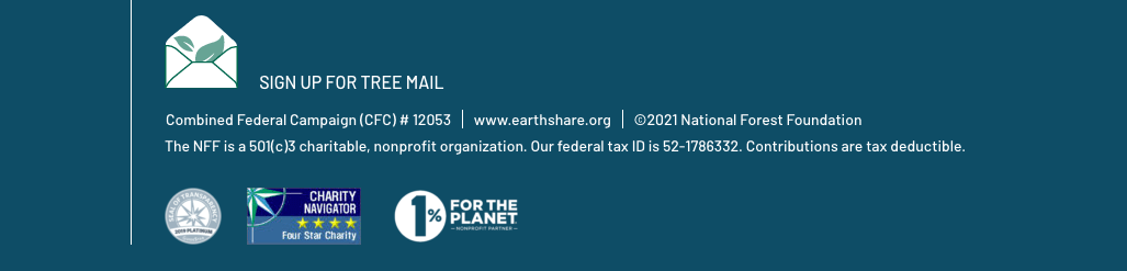
2. The National Forest Foundation has a delightfully clever name for their newsletter: Treemail. (Though I will say that they could stand to follow tip #3 and improve their “Sign Up” call to action here!)
3. World Bicycle Relief also uses a clever turn of phrase in their newsletter signup—“riding into your inbox!” All of their copy is focused on the theme of bikes and mobility.
4. Shanti Bhavan uses a clever headline to powerfully convey its mission. It’s what we can call “wit at its best”.
5. Technovation makes a clever play on the idiom “for a change”—both expressing their mission of girls making a change and of changing a status quo in which too few girls are given opportunities.
6. Down The Clever Factor
Where should you be less clever?
When incorporating cleverness into your nonprofit’s website, you want to be like Goldilocks—there’s a definite line between too much, too little, and juuuuuuust right.
“Too much” cleverness usually occurs when we’re clever in the wrong places. Critical navigation elements that users rely on to use your site should not be clever. They should be clear.
For a clear user experience (and one that’s accessible to everyone), it’s best to avoid being clever in places like these:
Navigation menu items*
Breadcrumbs (the little links at the top of a page that tell you where you are on the website)
Terms and conditions—such as one-time vs. monthly giving checkboxes
Answers to FAQs
*If you’re interested in more nav menu improvements, we’ve got tips on that, too! Get some practical tips for making your nonprofit navigation menu more effective.
Great Examples of Clarity Over Cleverness
1. Although they have a huge menu of options (a style that’s often called a “mega menu”), The Ocean Conservancy keeps things easy to understand with short, clear labels.
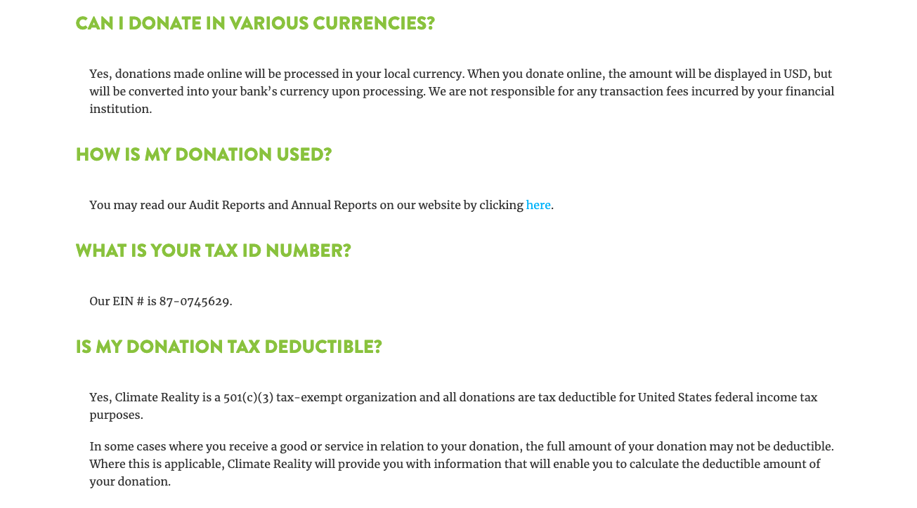
2. Climate Reality Project keeps its FAQs free from “marketing speak” and clearly answers the user’s questions in as few words as possible.
7. Remove Jargon or “Insider” Terms
Can someone outside of your immediate sphere understand what you’re saying?
This one relates closely to the last point. Just like you don’t want to be too clever, you don’t want to be too jargony, either. (By “jargon,” I mean insiders’ terms that do not have a meaningful definition outside of a closed group.)
Here’s some nonprofit jargon 101: “By emphasizing good governance and breaking through the silo mentality, we build capacity toward self-sufficiency within vulnerable communities.”
Most people would say, “Uh… what?”
Insider lingo can be confusing and off-putting to new website visitors, so it’s best to remove it as much as possible. Focus instead on inclusive words that everyone can understand, especially those with no background knowledge.
For nonprofits, the most common jargon culprits tend to be:
Programming: While you definitely want to use your official program names somewhere on your website, you should be careful about where. If a program’s purpose is not immediately clear from the name (such as “Brain Build”), then you might be better off using a more descriptive label (like “After-School Programs”)—either in place of or in conjunction with.
Mission/vision/about sections: Keep the technical phrases to the board room—not on your website and preferably not in your mission statement, either. When talking about your nonprofit’s work, use universally understandable language.
Job titles: “Chief Imagination Officer” might work for Disney, but most of us can’t get away with it. Especially for those who work directly with the public, it’s best to stick to understandable job titles so that people know who does what. (You can still be clever in your staff bios!)
Impact reports: In almost every case, your annual report should be titled “Annual Report” or “Impact Report.” You can add a snazzy subtitle or tagline, but the title itself should stick to the convention so that donors, funders, and grant evaluators know exactly where to find it.
Great Examples of User-Friendly Language
1. I love how OneGoal names its goal in understandable language. They go into programmatic detail elsewhere, but for most of the site, the vision is clear for everyone.
2. RAFI-USA does a good job of using an insider term (“basebuilding”) only when immediately defining it for us.
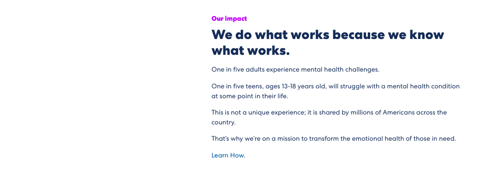
8. Make Smart Use of Imagery
Do your pictures complement the words on the page?
I know it may seem odd to have an entire point about pictures in an article about website copy…but you know the saying! If 1 picture = 1,000 words and we’re trying to keep things brief, then there’s no way around it: pictures are a critical amplifier of the words on the page.
Sometimes improving your copy isn’t really about changing the words; it’s about pairing them with imagery that does the talking instead.
Examples of Engaging Imagery on Nonprofit Sites
1. PARC National DES Virunga uses a powerful image to go with its appeal. One look at it and you know why you must come forward to support Goma!
2. Project Glimmer uses a black-and-white portrait of two young girls to perfectly capture their mission, expressing an exuberance that still feels serious and refined.
4. Women’s Sports Museum uses a black and white image of a woman athlete, that’s nicely edited to match its brand color and perfectly complements the copy.
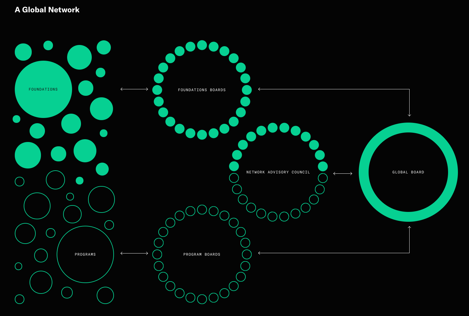
5. It doesn’t have to just be photos, either. Open Society Foundations uses data visualization to explain their structure far more effectively than a paragraph would.
9. Look for Copy and Content to Add
What words are missing from the page?
In addition to improving the words that are already on your website, think about the words that aren’t. What kind of copy could you add that would make your website more memorable, delightful, or effective?
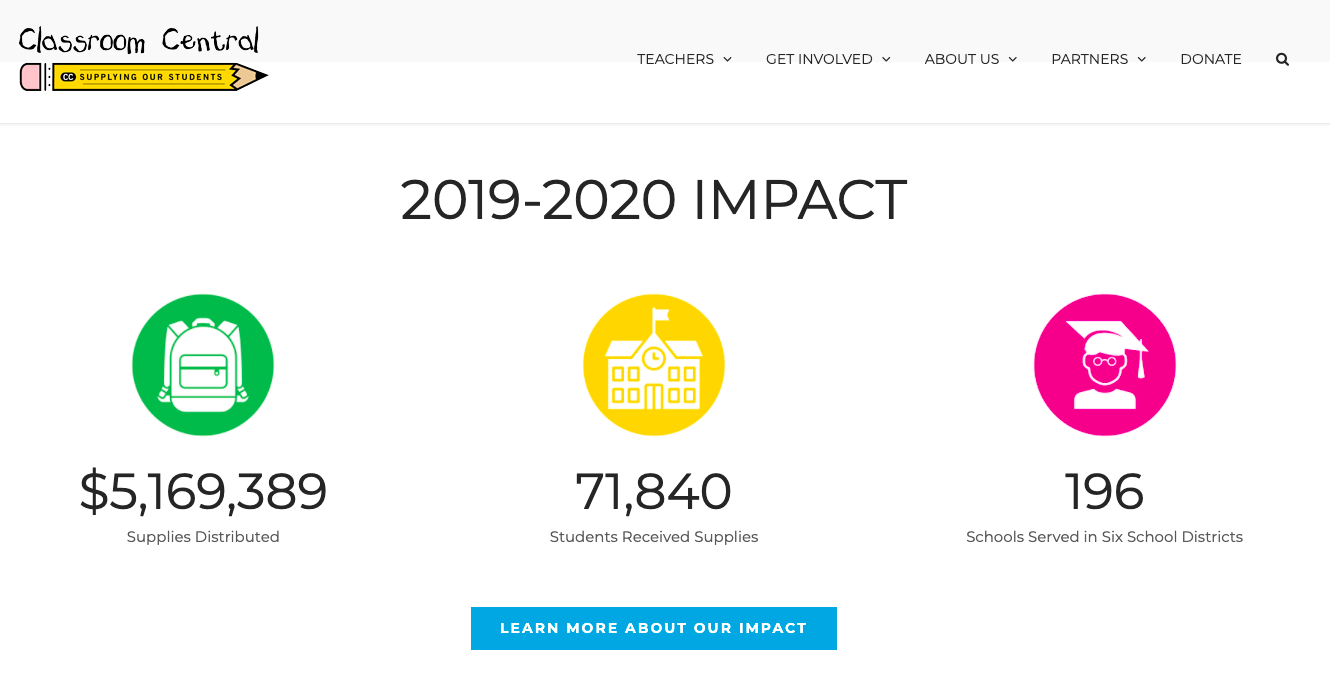
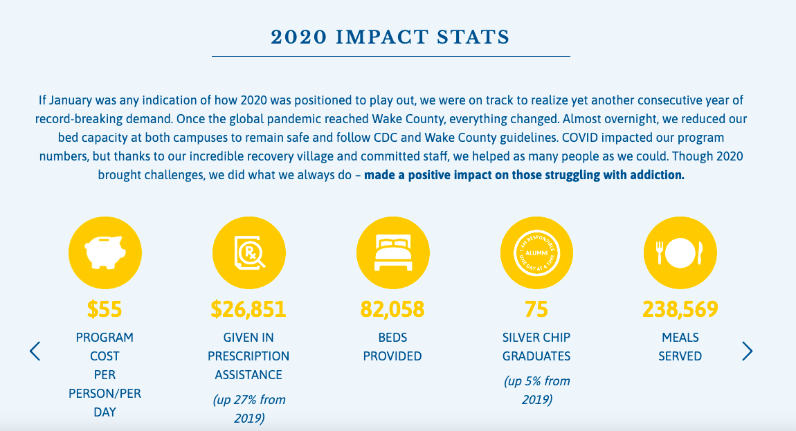
You should also check out Muso’s website which displays impact stats that speak to their audience through powerful images and numbers. Here’s how –
Another outstanding example would be that of Healing Transition’s annual report page. It’s not just informative but also very much transparent about each and every aspect of the year-long impact.
9.4 FAQs
We mentioned FAQs above, and if you don’t have any, they’re a wonderful thing to add to your site. Not only do they help website visitors find critical information, but they can reduce your staff’s workload by not having to answer common questions over and over again!
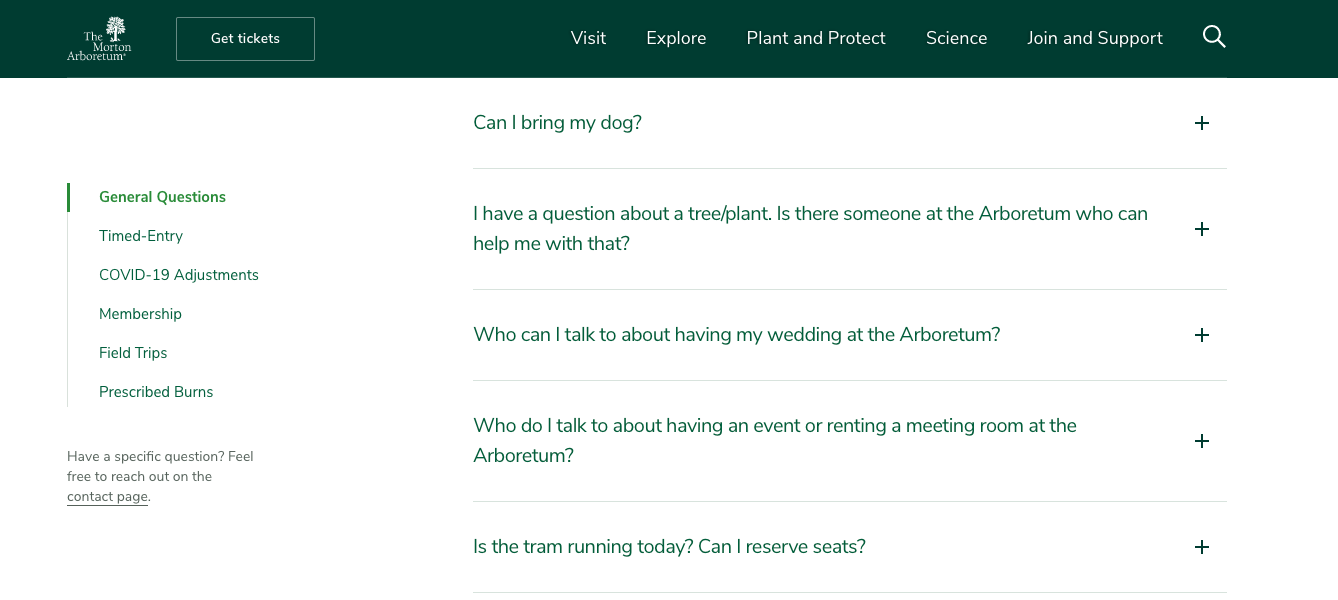
The Morton Arboretum has a very detailed FAQ page with excellent navigation at the side.
Where will You Start Improving Your Nonprofit Website Copy?
As you can see, there are tons of things you can do right now to improve your nonprofit website copy. With these suggestions in hand, I hope you’ll feel more empowered to assess the copy you currently have and to make targeted improvements to the words on the page.
Remember—even small changes can really amplify your impact online!
With a few thoughtful copy tweaks, you can build stronger relationships by delighting your website visitors, providing clearer and more helpful information, and capturing the unique heartbeat of your impact organization.
Donorbox has a curated blog with useful resources and tips on nonprofit management. Feel free to check it out!
About The Author
Andrea Schlottman is a design/content strategist, a 5-year digital nomad, and a hand embroidery enthusiast. She’s half of Pixel Lighthouse, an agency that helps nonprofits make a bigger impact online.