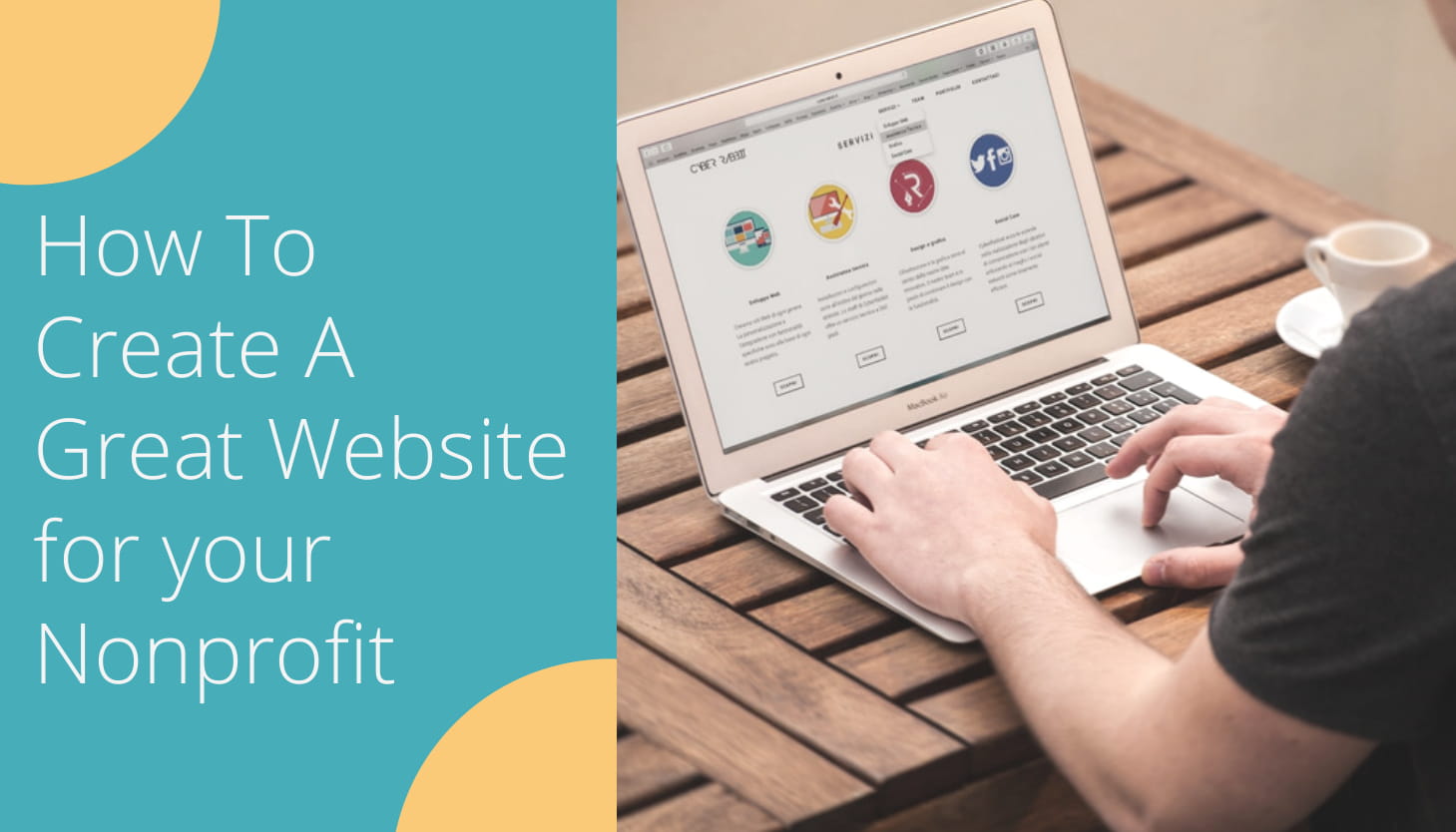
Online Fundraising Site: How To Create A Great Website for your Nonprofit
Having a nonprofit website is critical to your organization’s success. Your website should provide information on your nonprofit’s mission and should motivate donors to contribute to your cause. Your website’s design can directly affect your online fundraising efforts. We’ve gathered some attributes that any website should have. Check out the following best practices to make a fundraising website great!
Too often, nonprofits think of their website as simply a box to check off their to-do list. They know they need one, but they see it more as their listing in the yellow pages than what it can be: a window to the soul of the organization. Your website is one of the most important ways that the public interacts with you.
Having a nonprofit website is critical to your organization’s success. Not only is it where donors will go when they want to learn more information about your cause, but it’s also the place where supporters should be motivated to contribute.
Make sure that your website is designed in a way that appeals to prospective donors’ needs and, therefore, maximizes its fundraising potential.
Your website’s design can directly affect your online fundraising efforts. Countless studies have shown that a website’s layout can affect whether or not you’ll generate conversions (for example, someone making a donation).
A nonprofit website doesn’t have to be complex or expensive in order to be very effective. We’ve gathered some attributes that any awesome fundraising website design should have, followed by some examples of each.
6 Best Practices for Making a Fundraising Website Great
Fundraising is at the core of any nonprofit, so make it easy for people to donate online. If you follow some simple guidelines, then you are likely to increase the amount you can raise via your donation page:
Make Sure Your Online Donation Page and Form are Easy to Find.
A good rule of thumb: Try to keep supporters just one click away from your donation form no matter where they are on your site. That means having a donation button on your main navigation menu. Set it apart from the rest of the menu in an eye-catching color. The donation link should lead straight to the donation page and form.
A common mistake is adding extra steps or more text after someone clicks the donate button. While the intention is usually good, like informing donors of other ways to get involved, these extra steps can reduce the chances of someone making a donation.
Have a compelling “Why”.
Your donation page shouldn’t feel purely like a payment processing form. Instead, it should briefly and gently remind people why they’ve decided to give to your organization.
Use Fundraising Software for Your Donation Page.
An online fundraising software will make creating your own donation pages much easier and will provide you with a number of features, such as:
Pre-filled amounts with descriptions. This lets donors know exactly what they’re contributing to.
Integrated employer donation matching.
Recurring giving options. Place a recurring giving option on your form to see higher donor retention rates.
PDF receipts, and other features that will help you raise more money.
Pro Tip: Choose a powerful fundraising site to accept online donations on your website.
Doctors without Borders streamline their donation process by making sure visitors stay on their donation page once they get there.
The more distractions that are present on the donation page, the lower your conversion rate will be. Here’s a way to keep the donation process focused exclusively on the task at hand: converting that page visitor into a donor:
Hide the standard top navigation in the header of the donation page.
Employ a simple footer design
Eliminate unnecessary links
Hide social media icons
Use text sparingly
2. Optimize your website and donation form for mobile devices
Your website and your donation form should be mobile-friendly. This means that the site pages resize according to the device being used to allow for optimal viewing.
Our smartphones are becoming an increasingly popular way to connect, share, access information, and donate. We’ve come to expect optimized pages when donating.
From NP Source, we learn that in 2018, mobile devices accounted for 57% of all Internet traffic. In the past year, mobile giving donations have increased by 205%. 51% of people who visit a nonprofit’s website will do so on a mobile device.
To make your website mobile-friendly, you should avoid using large photos that require donors to scroll down to reach the actual information. Your text should also be large enough to be read on small devices. Not sure if your site is mobile-responsive? Whip out your phone and check!
Proper navigation is also a key component of mobile-friendly websites. When viewing websites on mobile phones, there’s not a lot of space for dropdown menus or complex navigation with a ton of content. Simplify your mobile navigation so that only the essential information is available.
NP Source also found that by incorporating a mobile-responsive design, nonprofits can increase their donations by 126% on average. If a visitor becomes frustrated when attempting to make a donation to your organization on their mobile device, chances are good that they will leave your site without giving.
Given the rise in mobile giving, nonprofits that focus more on mobile fundraising will have an extra edge over others. You can tap on a lot of opportunities for interested donors via mobile giving. Read our in-depth guide on mobile fundraising and implement some of the best practices to accept donations online.
3. Problem, Solution, Impact
If you think of donating as a buying decision, your website should be answering questions and countering possible objections in the donor’s mind.
Why should I part with my money?
Why should I donate to you as opposed to another cause?
How do I know my money is going to be used wisely and ethically?
To build the content on your website, start with the problem you’re solving, how you’re solving it, and why it matters for the site visitor to be involved. The stream of consciousness to scrolling down a page of your website goes something like this: awareness of a problem, the solution to the problem, and the motivation to become part of the solution.
You should follow up on the “problem” with your organization’s explicit solution to that problem. Then move to the immediate impact of your organization. Prove the efficacy of your solution by demonstrating an impact through eye-catching visuals. Did you know that the brain processes visuals 60,000 times faster than text!. Your content is much more compelling and engaging when you include high-quality:
Photographic imagery
Graphics or infographics showing statistics, data, or process
Videos and vlogs
Donors want to know that their hard-earned money is going to a good cause. They want to know what your organization is going to do with their money. Transparency means being open and accountable to the donor. It means being dependable and true to your word.
People may not give unless they see examples or proof on your website that their gifts will be well-utilized. Some donors may look you up on sites like CharityNavigator, but you will save them time and worry if your website provides specific information. This can be statistics, reports from the field, or financials so that donors have a level of comfort with your organization.
Heifer International features a box on its homepage that combines transparency and accountability statistics with a call to action. They’ve included donation buttons with different gift amounts.
Heifer also has sharing buttons on every page that lets donors know they can share the page with their Twitter or Facebook accounts.
They also have a separate section that provides supporting financial information to support due diligence by potential donors.
4. Prioritize the “About Us” page
When potential donors or volunteers check out the services on your website, the “About Us” page is likely in their top 3-4 clicks. They want to make sure they are making the right choice by supporting your organization. Don’t make it an afterthought. Understand what this page is really for. Even if your nonprofit has amazing results to highlight on the website, people should be able to get to know who you are first. That’s what this page is about. It’s like a “first date”. It’s all about the getting-to-know-you stage, building rapport, and making a memorable impression.
Unfortunately, the About Us page can become a dumping ground for a lot of things. Avoid cramming everything into this page. Your annual report, financials, mission statement, staff bios, and company history can merit their own place on the website as a separate page. Keeping these from creeping onto the page can also ensure you don’t dilute their own respective importance. Make this page solely reflect your nonprofit’s personality and values.
Make the page about who you are in the strictest sense:
Who does your charity aim to help? Are you fundraising for environmental/planetary reasons, human rights, animal welfare? Be clear about what or who you’re fundraising for.
What you do: All organizations have a back story. What inspired you to start?
Why you do it: Give details about what projects you’ve worked on in the past, let donors know what you’re currently doing, and what do you have planned for the future?
Think high-level, and stick to highlights. This is really an opportunity to drive home exactly what you do in one memorable and meaningful page.
You may notice that some organizations frame the About Us section in a slightly different way. Some call it “Our Story,” “Who We Are” or simply, “Learn.” These all convey the same intent: to find out what you’re all about.
Don’t discount the impact of visual storytelling and its ability to present your nonprofit’s story in a more compelling way. While the good text is still essential on your About Us page, sometimes its role is to just be supportive and contextual to photos, graphics or videos.
Lengthy content doesn’t always translate into lasting impressions. When you’re thinking about how to write an About Us page, avoid the long-winded version of your story.
Stick to the elevator speech, but in written form. That is — write the content as if you have to sell your organization in the time it takes people to ride from the top to the bottom of a building in an elevator. Be persuasive and hit all the high points of what makes your nonprofit so great and distinctive. Keep your content compelling, but concise.
The Nature Conservancy does their About Us page really well. They call it “Who We Are”. A three-minute video tells their story, and compelling stats capture the scope of their work. Think Show and Tell. It’s not one or the other. Consider sprucing up your About Us page by injecting some photos, graphics, or a video.
5. Do Use Video
A successful fundraiser depends on the donors. It isn’t about educating people so much as connecting with people. That’s why video is so important to incorporate into your website. Videos allow you to combine your story with emotion to create a connection with your audience that words and photos simply cannot build.
Video offers incredible opportunities for your nonprofit to bring in supporters, engage them in your work, and help you fundraise. Video can help your audience visualize why you exist, move them to feel genuine emotion, and motivate them to care, share, and take action.
Online, video rules. In terms of likes, shares, downloads, and donations, video consistently outperforms all other forms of digital communication.
A nonprofit fundraising video that lasts 60-seconds may be equal to 1.8 million words or 3,600 pages of text, but the raw emotion captured is what matters! Here are some other video stats that nonprofits should know:
92% of nonprofits say they value the investment they made in the video.
You don’t need to make a Hollywood movie to incorporate video into your website.
Did you know that homemade, “raw” nonprofit videos often outperform high-end productions on the web?
Videos recorded on individuals’ smartphones are often the most effective way to capture and showcase the essence of your mission and the good you are accomplishing. While many nonprofits are succeeding with video, others can struggle to best utilize this powerful medium.
Here are just a few tips to get started with video:
Use the iMovie App to produce videos and upload them to YouTube and Vimeo. In just a few hours a member of your team can master iMovie. Your nonprofit will be able to easily create, edit, and publish fundraising videos that can also include titles, photos, music, and effects. Search “How to use iMovie on an iPhone” to find free training videos.
Compile a library of footage taken by volunteers and staff. Show the good you are doing with inspiring behind-the-scenes footage and interviews with program recipients.
Be passionate and show donors how they can help contribute.
Say Thank You by continuously recognizing donor generosity and support.
Ensure that you always have a clear call to action at the end of your videos! Don’t just leave your audience hanging – ask them to make a difference.
Post videos to YouTube, Vimeo, and Facebook and cross-promote with email and text as often as you have something compelling to share.
Examples of Successful Nonprofit Fundraising Videos:
Save The Children:
This excellent video by Save the Children creates a compelling narrative about children in war zones, specifically for their #SaveSyriasChildren campaign. Not only is the video very well-produced, but its storyline builds a connection between the viewer and the child in the video, which embodies the core of Save the Children’s mission. The video exemplifies good storytelling and messaging.
Slaying Childhood Cancer by Alex’s Lemonade Stand
This video simply and candidly tells the story of one person’s struggle. The father of a young cancer patient chronicles his painful experience with the disease but maintains such a lighthearted and uplifting portrait of his daughter that it’s impossible not to be moved. It’s a compelling example of how simple, personal storytelling is equally as effective as the results of big production budgets.
The Adventure Project
The Adventure Project builds community through entrepreneurship, sponsoring jobs in developing countries to improve child survival, reduce conflict, and move people out of poverty for good. This video demonstrates the results of one particular project and is a great example of how an organization can use video to define and demonstrate the impact of their work.
Sophia and Olive Draw India for the Measles and Rubella Initiative
This video is awesome because of how simple, yet mesmerizing, it is. At 3 minutes, it’s long enough to gain a deep understanding of the work the Measles and Rubella Initiative does. The focus on someone’s experience in one region allows the viewer/listener to more deeply connect with the story being told.
This nonprofit uses a long looping video for their homepage. It does not include sound but merely showcases scenes of their work fighting for human rights and providing education to children in conflict zones.
6. Make volunteer recruitment easy
If your organization uses lots of volunteers, then think about how volunteering opportunities are integrated into your website.
Do you have a link or button to a volunteer page on your homepage?
Does that page adequately describe the volunteer experience and its requirements?
Can volunteers contact you easily from your volunteer page?
How easy is it for volunteers to click to join from other pages on your site as well?
It goes without saying that if volunteers do contact you as a result, you need to respond promptly.
Even if you only need a few volunteers, a volunteer page has value. You may connect with people you didn’t expect who are interested in your work through your volunteer link.
You don’t have to call your Volunteer page “Volunteer”. “Get Involved” is often used. This Take Action section on theGirl Up website is equally effective. Not only can you easily get information on different ways to support them, but you can also search for the Girl Up club closest to you. They go out of their way to present visitors with every opportunity to get involved.
An online fundraising site doesn’t need to be expensive and complex in order to be effective. Beyond Bars Animal Rescue is a small organization that features a Volunteer link prominently on its homepage.
Conclusion
Essentially, you want your nonprofit website to be straightforward, uncluttered, and easy to navigate. Limit the number of images, media, and links to only what’s necessary, and organize your content in a way that feels logical. Make your media count. Remember: every extra step in the navigation process is a chance for a donor to get distracted or second-guess their decision to donate.
Here’s the bottom line:
Once you start thinking of your website as a potential generator of revenue, PR, and partnerships, the importance of keeping your site updated and user-friendly becomes apparent. If you have a mediocre website with mediocre content, you will get a mediocre response from visitors. But if you have a website that illuminates your cause, conveys your impact, and touches visitors, you will have a powerful recruiting and fundraising tool available 24 hours a day.
Raviraj heads the sales and marketing team at Donorbox. His growth-hacking abilities have helped Donorbox boost fundraising efforts for thousands of nonprofit organizations.