Now… You might think that designing your nonprofit logo is a topic of interest for designers or visual content creators on your team. And you might think it has little to do with fundraising. But effective fundraising is all about creating trust and familiarising the public with your image.
Your Nonprofits’ Logo is the first step towards this.
Having a recognizable logo that meaningfully represents your nonprofit organization leads to increased trust and donor acquisition.
Good nonprofit branding also helps you stand out amongst other similar nonprofit organizations and get your message across in a noisy space. While a brand is more than its visual identity (the name, the logo, and graphic design), a great logo is definitely the centerpiece of your brand.
Your nonprofit logo is essentially a visual representation of everything your organization stands for; it counts for most people’s first impressions of your nonprofit; it speaks about your professional standard, and it’s somewhat of an ambassador for your cause.
In other words…It’s crucial to get it right.
But creating a logo can be deceivingly hard to get right. In this blog, we will learn how to design a great nonprofit logo that reflects your mission and vision. Then, we will explore the 5 Best Nonprofit Logos so that your nonprofit can take inspiration.
Let’s dive right in.
Top 7 Tips To Design A Great Nonprofit Logo.
1. Reflect On Your Mission
Your logo should, as much as possible, represent your nonprofit’s mission. Before embarking on your logo design journey, make sure you dust off those mission and vision statement documents and take some time to reflect on them.
Once you’re reminded of what it is that your nonprofit organization is working towards, write down a few words that you feel like encapsulate your efforts (in case you haven’t already done when formulating your mission statement).
Specify what symbols, images or words best represent your values and your mission.
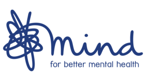
For example, Mind’s logo includes both a clear description of what the nonprofit does in four words (‘for better mental health’) and a very compelling and clear visual representation of their work (i.e. tangled lines getting untangled – representing mental health getting better or ‘under control’).
2. Consider Developing A Tagline
A tagline incorporates into the logo and sums up your nonprofit organization’s services in 3–7 words.
While not necessary, a tagline could add an extra dose of interest to your logo design.
There are a few different types of logos:
- Font-based logos have primarily text with the name of the organization.
- Icon or symbol logos have no text and merely a graphic to represent the organization.
- A combination logo combines text and an icon for a complete logo image. These tend to be the most common.
Taglines are usually added to combination logos. And sometimes the logo ‘follows’ the tagline. Think Nike. Their logo is a “tick”, a symbol that says “just do it”. This kind of brevity creates the biggest impact.
A tagline can be a description of what your nonprofit does or a catchy phrase.
Once you’ve come up with a few good tagline options, ask yourself these five questions about each one
1. Is it original?
2. Is it future-proof? (a.k.a. Will it evolve with your organization?)
3. Is it user-friendly and easy to spell?
4. Is it available (domain, social channels, etc.)?
5. Do I love it?
(looka.com)
3. Pay Attention To Your Color Palette
Colors play a crucial role in determining a brand’s message. For example, if you use red as the main color in your logo, it could send the message of your brand being aggressive, passionate, and/or energetic.
Blue represents seriousness, safety, professionalism, communication, freedom, security, and trust. It brings the allure of power, tranquillity, and dependability. It’s often used for water, peace, and democracy-related organizations.
Red represents emotions such as passion, enthusiasm, aggression, love, violence, power, rebelliousness, appetite, impulsiveness, and emergency. It’s often used for health, food, anti-violence, and lifesaving nonprofit organizations.
Yellow represents optimism, warmth, and clarity. It symbolizes warmth, youth, sun, energy, cheerful emotions, organization, clarity, clearness, and caution. Yellow stimulates attention, so it should be used sparingly.
Black and white represent elegance, sophistication, and class. Purple is connected with imagination, fantasy, and creativity, pureness, serenity, royalty, luxury, and rarity. Green is used for nature, recycling, and everything else that helps sustainability and the environment. It’s often connected with the Earth, organic, growth, calmness, harmony, and money. Pink is feminine and associated with female traits, and brown is earthy, cozy, and familiar.
As you can see, every color evokes an emotion (and these could also be cultural – so check this if you’re a local organization), which becomes its message for the viewers or customers.
The number of colors you use in your logo is really up to you. 2 to 3 colors are generally what most brand names use. The colors should balance evenly and shouldn’t fight each other on the design.
The logo should carry its depth and personality across all media — whether on t-shirts, banners or flyers.
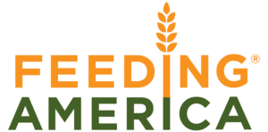
Feeding America (see below), for example, uses a very descriptive logo and strategically uses earthy colors.
Pro tip: For a nonprofit, keeping printing costs low could be an important consideration.
4. Pay Attention To Your Typeface and Other Visual Elements
The font plays a huge role in branding, especially when we talk about a wordmark or lettermark logo.
Serif fonts (think Times New Roman) are more classic, elegant, and formal, and sans-serif types are most commonly associated with feeling modern, friendly, direct, clean, and minimal.
- Formal, Reliable: Didot, Georgia, Times
- Elegant, Classic: Snell Roundhand, Buttermilk, Edwardian
- Friendly, Contemporary: Josefin, Museo, Clarendon
If you really want to go the extra mile and if it fits your brand feel, consider using a custom type. Custom type helps to ensure that your unique logo will stay that way. This is one of the harder styles to pull off because script fonts are harder to read at a glance — but when done right, they can make your logo distinctive and iconic (e.g. Coca Cola).
Different visual elements, shapes, and layout options provide different containers for your logo.
Like colors and typefaces, shapes play an important role in your logo aesthetic because they hold particular associations in the human brain.
For example, circles can represent unity, security, and protection. They work best for shorter names or monograms. Squares and rectangles translate to feelings of stability and balance and are good for longer names. Triangles can be used to represent direction and movement, or a substitute for the letters ‘A’ and ‘V.’
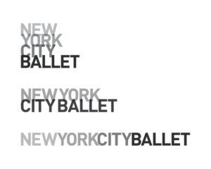
New York City Ballet uses an elegant and modern typeface that perfectly represents their brand.
5. Think About How You Want To Make People Feel
While it’s important for your logo to sum up what you do, it’s equally as important for your logo to make people feel what you want them to feel.
For that, you need to be clear on your brand vibe. If you don’t have brand guidelines already, now could be a good time to start.
Brand vibe is something like your brand’s personality. For example, is your brand contemporary or quirky? What does your typical donor care about, and what does your brand aspire to be?
Whatever your brand feel and personality – it should be consistent across all of your brand elements and your content (including your logo), and clearly set out in your brand guidelines.
For example, we want our banks to feel trustworthy and safe and we want our meditation apps to feel calm and gentle. Take some time to jot down a few words about how you want to make people feel.
Why is this step important? When you know how you want to make people feel, it makes it much easier to proceed with the rest of the steps.
6. Simplicity Is Key
“The designer behind the famed Twitter bird icon once told me his core rule for logo design: ‘Only do one trick.’ I love this focused approach, as it forces you to prioritize simplicity and not over-design.
Some of the smartest businesses these days are those with the simplest solution to solving a problem, and this philosophy is carried to the branding.”
– Leif Abraham, CEO & Co-Founder, AND CO
Keep your logo “clean”. Having lots of blank space will achieve this. Avoid using too many intricate details.
While it’s important to make your logo memorable and creative (see the point below), resist the temptation to overwork your logo.
Subtract unnecessary elements until the logo represents your nonprofit in its most basic form. Appreciate the fact that the simpler the logo design is, the more memorable it will be.
Simplicity is indeed the ultimate sophistication.
7. Make It Memorable.
Your logo shouldn’t be too complex to be easily remembered. Timeless, classic design will go a long way. Trends come and go and while it’s important for an organization to employ fresh and up-to-date tactics to engage their audience when considering a logo, longevity is key.
Your logo should not have any drastic alterations once produced. Choose something which will stay current for 10–20 years or longer.
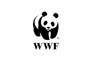
Think WWF. Their logo has been in use since 1966. The black and white panda logo with its creative use of negative space is a perfect example of a simple and timeless design. Because this pictorial mark uses a single color, it’s very adaptive to different mediums.
Your logo should be instantly recognizable and work in any medium, consolidating your brand upon a single encounter.
Bonus: Tips & Best Practices to Design a Perfect Nonprofit Logo
1. Avoid Clichés
You might want to avoid the clichés in your particular field (e.g. holding hands, hearts, leaves). These cliché symbols are so overused that even if they are easy to understand, they don’t stand out in the viewer’s eye. You may want to go with a unique symbol that represents what you do differently than competitors. It’s tempting to just throw an industry icon on the page, but it’s important to think creatively. “The Mercedes logo isn’t a car. The Virgin Atlantic logo isn’t an airplane. The Apple logo isn’t a computer,” says David Airey, a graphic designer, and creator of website Logo Design Love.
2. Pick a Designer
It’s best that you get your logo designed by a professional designer. Since resources can be limited, you could still get a logo designed by a professional designer at minimal costs by reaching out to design students or designers still looking to build their portfolios. Some design agencies even offer lower rates for nonprofits and charities.
3. Easy to Print
Your nonprofit logo should adapt to all sorts of different mediums—online, in print, or on merchandise. Make it easy to print your logo in color or black and white, make it simple to reproduce and make it easily printed on various types of media. When working with a designer, keep this in mind. For example, if your logo involves a long tagline it might be harder to read and see online.
Think about how your logo is going to be used. If you’re going to be doing a lot of networking, perhaps create a logo that is horizontal and looks good on business cards.
4. Think of Your Target
The best logo will connect to the most specific target market possible. Your logo and other visual content, your message, channels, and tone should all be based on traits of your best target demographic.
Once you have your logo design concept, take the time to check if there are any hidden words, meanings, or even cultural misunderstandings. Get a second, a third, and a fourth opinion before you launch your logo out into the scary big world.
5. Design Variations
Always have your designer use a vector format, so you can resize your logo infinitely. Start your design in black and white and make sure to check the scale throughout your process. Confirm you have different logo variations for different uses. For example, the logo you have as your Facebook profile photo might be a symbol-only or monogram-only version, while a logo you print on a T-shirt would be the “full” logo.
5 Best Nonprofit Logos That You Can Take Inspiration From:
1. The Mentoring Project
The Mentoring Project achieves a beautiful result using only one color. This logo is also an example of effectively using negative space. They also manage to, in a clever way, showcase what their organization does by overlaying two elephants. The Mentoring Project connects children that need guidance with someone who can mentor them and serve as a positive role model (like the white elephant is guiding the black elephant).

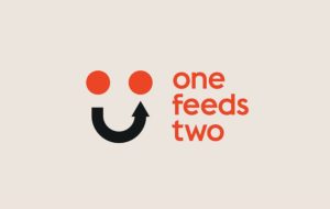
2. One Feeds Two
One Feeds Two logo is simple and ingenious. Like its name, the logo of this nonprofit points exactly to what the organization does. They bring together food companies, feeding charities and consumers to give nutritious school meals to children living in some of the poorest places in the world – effectively working in the ‘one for one’ model of change. With the two dots and the arrow creating a “smiling” face, the sentiment is also very positive and ‘feel good’ which is sometimes a rarity with nonprofits addressing hunger.
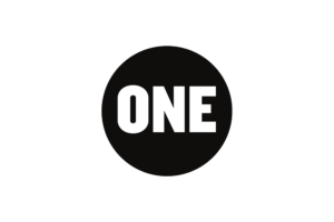
3. One
One’s logo is simple and powerful. They are an advocacy organization fighting extreme poverty. Their black and white logo relays their serious approach to the issue, without any flairs. This logo will also work well across a variety of mediums.
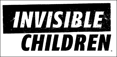
4. Invisible Children
Another black and white logo, the Invisible Children logo is designed so as to relay the gravity of the issue they’re working on addressing. Invisible Children campaigns to end the abduction, killing, and displacing of civilians in East and Central Africa. The logo is stark and serious and evokes precisely those emotions in viewers.
5. Girl Scouts
Girl Scouts logo is a phenomenal example of something that speaks both to its members and those who aren’t familiar with the inner workings of the organization. The logo is a trefoil. “Trefoil” means three leaves. Each leaf in the traditional or contemporary Girl Scout trefoil stands for a part of the Girl Scout Promise – To serve God and my country; To help people at all times; To live by the Girl Scout Law. For those that aren’t familiar with the symbolism, the logo still speaks through female-shaped faces and the color green evoking nature, growth, action, and youthfulness!

Let’s Recap
To design an amazing nonprofit logo, it’s a good idea to research your brand and revisit your mission, learn the basics of logo design, explore colors, fonts, and symbols, make sure your logo is simple and memorable …and then get creative!
As a tool to connect with new generations and supporters, your nonprofit logo deserves considerable attention. Whether you’re an established nonprofit going through a rebranding process or just starting out, put thought and effort into creating a unique logo that truly represents who you are and communicates that to your audience effectively.
Choose Donorbox as your donation system and check out our Nonprofit blog for more nonprofit resources and tips.