See for yourself how easy fundraising can be with Donorbox.Watch the Demo now
Why Your Church Giving Page Might Be Confusing Your Givers (And How to Fix It)
Too many disconnected giving options can make donating harder than it needs to be for your congregation. Here’s how to simplify your church’s giving experience while still providing supporters with plenty of ways to give.
It’s 9:40 on a Tuesday night, and someone in your congregation is thinking about Sunday’s message and feels inspired to give. They open your church’s giving page and find a donation form, a separate Venmo handle, a Cash App portal, and an old PayPal link.
They pause. Which one am I supposed to use? Does the church prefer one? Will I get a receipt from all of these?
The moment that felt simple ten seconds ago now feels like a small research project. That moment of friction can often be enough to interrupt a gift. And when someone closes the page without donating, your church may never know how close they were.
Key Takeaways 💡
Simplify the path to giving. Too many disconnected buttons, links, and payment apps can create friction.
Offer choice without clutter. Different congregants prefer different payment methods, but they shouldn’t need separate giving experiences.
Bring payment options into one form. A unified giving experience makes it easier for donors to use the method they know and trust.
3 Ways Your Church Giving Page Is Causing Friction
1. Churches have a checkout abandonment problem
E-commerce companies have studied this behavior for two decades, and the findings are remarkably consistent: most online checkouts are abandoned before they’re completed, and complicated or confusing checkout flows are one of the leading reasons people quit.
Churches face the exact same behavior with none of the same attention on it. We tend to treat the giving page as a utility. Set it up once, add links as new payment apps come along, and assume that anyone who really wants to give will figure it out.
But generosity doesn’t work like a utility bill. Giving is often an in-the-moment response to a sermon, a need, or a prompting. Friction not only delays that response, but also quietly filters it out.
2. Your congregation’s payment expectations have changed
Digital giving is already a normal part of church life. Barna found that 75% of Christians believe churches could benefit from online giving, which shows how comfortable congregants have become with digital ways to support their church.
Those expectations are in line with how people pay everywhere else, too. U.S. consumers made an average of 11 payments per month using a mobile phone in 2024, up from just 4 in 2018.
Your church is serving several payment cultures at once. Your 24-year-old worship volunteer lives in Venmo and Cash App. A young family may default to PayPal or Apple Pay. Longtime members may prefer a card on file or a bank transfer, and some will always love the offering plate, which is a beautiful thing worth protecting.
The takeaway isn’t that one method wins. It’s that people give most readily through the method they already use every day. When their preferred way to pay isn’t available or isn’t seamless, they don’t switch methods. They give less often or postpone the gift entirely.
3. The “button sprawl” problem
Here’s how most churches end up with a cluttered giving page, and none of it comes from bad decisions.
The church sets up online giving through its primary platform. Then someone asks, “Can we take Venmo?”, so a Venmo handle gets added to the page. And then Cash App, because the youth ministry parents asked. Then a PayPal button from that one campaign three years ago.
Step back and look at what a first-time giver now sees: a bunch of different buttons representing different experiences. Each one has its own login, its own confirmation screen, its own receipt (or no receipt at all). None of them talk to each other. And the page itself now asks the giver to make a technology decision before they can make a generosity decision.
That’s backward. The moment someone decides to give, every question after that should already be answered.
How to Simplify Your Church Giving Experience
The fix isn’t removing payment options. Your people really do want those options. The fix is bringing them into one place.
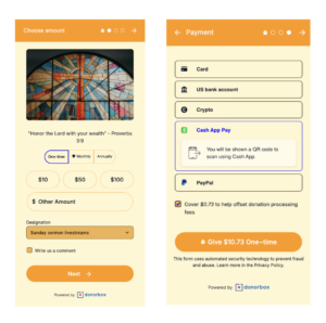
That’s the idea behind the Donorbox OmniGive™ Donation Form, for example: a single giving form that presents every major payment method inside one clean, mobile-friendly experience.
Venmo, Cash App, PayPal, Apple Pay, Google Pay, credit and debit cards, bank transfer, and more. Dozens of payment methods in all – dynamically displayed based on your donor’s location and device.
The giver opens one form, chooses the method they already trust, and completes their gift without ever leaving the page. Every gift produces a consistent, automatic receipt. And for returning givers, saved payment details mean a repeat gift takes seconds to complete.
The same streamlined experience also makes recurring giving easier. Donors choose their preferred giving interval right within the form before selecting their ideal payment method. Simple, ongoing support for your church.
One form also means your giving page becomes dramatically simpler. Instead of a stack of buttons and handles, you have a single, confident call to action: Give.
Start With a Five-Minute Audit
You don’t need a committee to act on this. Open your church’s giving page on your phone. Not your office computer – your phone – because that’s where your congregation is, and count.
How many buttons, links, handles, or QR codes does a giver have to choose between?
If the answer to the first question is anything more than one, you’re asking your people to pay a friction tax every time they respond to God’s prompting toward generosity.
Your congregation wants to give. The most pastoral thing your giving page can do is get out of their way.
Ready to see what a unified giving experience looks like? Explore how Donorbox OmniGive brings every payment method your people already use into one simple form.
Justin Dean is a marketing strategist and fractional CMO who helps churches, ministries, and mission-driven organizations grow through clear positioning and practical go-to-market strategy. He spent five years leading marketing at a church technology company, previously served as communications director for one of the largest churches in the U.S., has founded several national church conferences, and has authored two books, including PR Matters: A Survival Guide for Church Communicators. He lives in Gainesville, Georgia, with his wife and kids

 Join the fundraising movement!