This is a guest post by: Ronita Mohan – Venngage, Professional Infographic Maker
Nonprofit marketing is a challenge. Budgets are restrictive, and whatever capital a nonprofit has at its disposal is generally required for other activities.
Meanwhile, competition in the digital sphere is immense, with nonprofits competing for space with larger organizations.
With fewer resources at hand, nonprofits have to get creative in the marketing materials they use to reach donors.
While press releases and advertising continue to have their place in marketing campaigns, visual content marketing has become a much more effective ploy.
Visuals in marketing have gone further than stock photos and low-resolution images—graphics are being seen as a better way to attract leads and donors to your content.
At Venngage, we know how important graphics are for promoting small businesses and nonprofits, which is why we have a library that includes a number of nonprofit infographic templates.
In this article, we will look at five infographic templates that nonprofits can use to boost their marketing and attract new donors.
Why Should Your Nonprofit Use Infographic Templates?
Before we look at our hand-picked templates, many nonprofit marketers might be wondering why infographics are being singled out among the many graphics available.
Infographics are unique in their ability to marry visuals, icons, data visualization, and text into one all-encompassing graphic that is both informative and visually appealing.
Over the past decade, infographics have enjoyed a fair amount of success in the marketing world, but their overuse saw a decline in quality and appeal.
That has slowly changed since 2017 when infographics began to see a resurgence as a powerful tool for sharing information and as a marketing tactic.
Much of this is due to the fact that fewer marketers and designs are making infographics, which makes the rare sight of an infographic that much more memorable.
Additionally, few sites offer infographic templates that are high quality and won’t impact a nonprofit’s budget.
Templates are customizable and flexible, which saves marketers time and energy they would otherwise have devoted to making a graphic from scratch.
Templates are also reusable—a few changes to an existing template and a marketer has access to brand new content with minimal effort.
For these reasons, infographic templates have become a key part of content marketing strategies.
Now that you know why you should be using infographic templates for your nonprofit marketing efforts, we will look at the five kinds of templates you can use.
Here are 5 types of nonprofit infographics for a successful fundraising campaign:
- Statistical Infographics
- Informational Infographics
- Simple Infographics
- List Infographics
- Icon Infographics
1. Statistical Infographics
Statistics are an excellent way to attract attention to a visual. Statistics are easy to see and with the right layout and visual elements, can easily convey information to a casual onlooker.
And it is important for marketers to make their content, visual and otherwise, easy to see at a glance. Internet users are paying less attention to the bulk of content that comes their way—the steady stream of updated news and information on social feeds has led to people only reading headlines.
Using stunning visuals to attract attention only does half the job—maintaining interest now requires a piece of content to be easily digestible and a fast read.
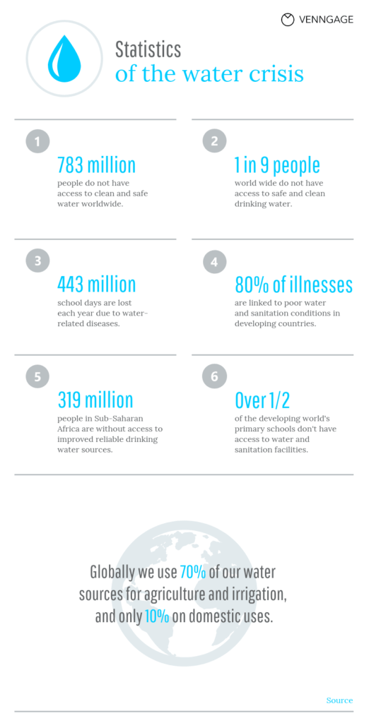
That is why statistics have become so handy. Statistical infographics are a great way for nonprofits to convey survey results or share data from research—which will attract the attention of donors.
You can see in the below example of a statistical nonprofit infographic how using numbers and colors makes for a great piece of content.
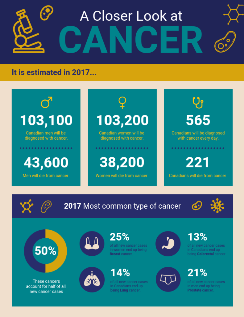
The above infographic has a number of statistic sets that give interested parties a thorough overview of how many people are afflicted with cancer and the kinds of cancers they are susceptible to.
You will also have noticed that the statistics in this infographic are accompanied by simple icons. Icons give the information context without being overwhelming.
For readers scrolling through their social media feeds, the simple color combination and layout will entice them to stop and read further and will boost engagement with the post. The infographic can also be shared as an e-newsletter, a poster, or a handout.
A statistical infographic is concise, neat, and easily conveys a large amount of information to attract attention from casual viewers as well as interested parties.
2. Informational Infographics
There are some subjects that cannot be shared through sets of numbers. This is where an informational infographic comes in.
Informational infographics tend to be text-heavy and are laid out like blog posts—they often have a heading, sub-headings, body copy, and sometimes bullet points or lists.
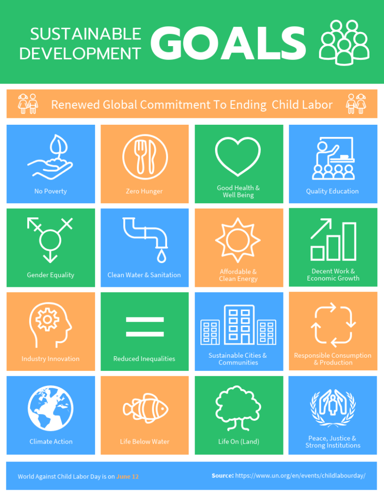
You can see in the below informational infographic how the layout varies from statistical infographics.
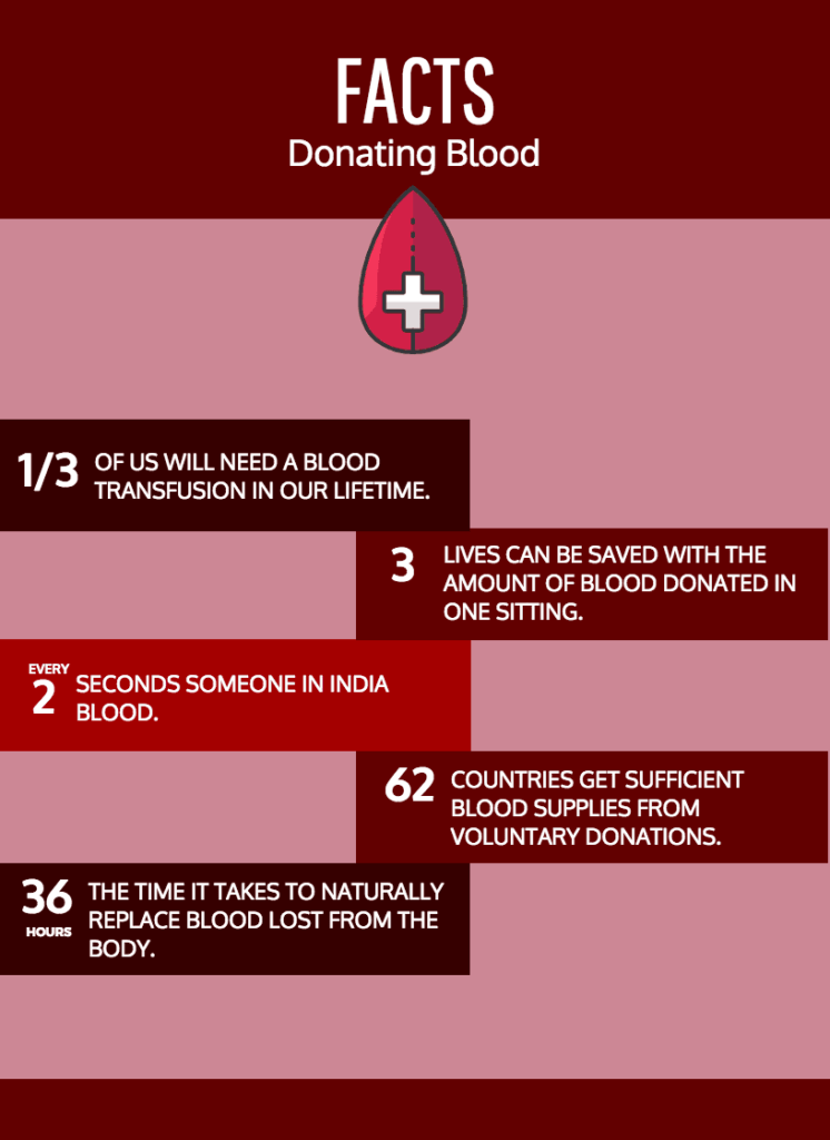
The informational infographic is usually divided into blocks of text, which makes it easier to read. Though the above infographic doesn’t have section headers, it does use numbers to separate each block.
The important thing to remember when creating an informational infographic is the use of color. While it can be tempting to limit color use to speed up the process of customizing the template, colors should be used to distinguish the sections.
The above infographic effectively makes use of the color palette by using shades of red. Not only is this relevant to the subject matter—blood donations—but it also makes the blocks distinctive.
An informational infographic is a good visual to share large amounts of information while still being concise.
3. Simple Infographics
As the name suggests, the simple infographic focuses on minimalism in sending its message.
There are a number of reasons why a nonprofit would want to use a simple infographic. Not all messaging relates to statistics, nor do nonprofits always have large amounts of information to share.
Sometimes, all you want to do is get a single message to your audience along with a call to action. That is why a simple infographic, like the below example, which is to the point and also informative, is the visual you need to use.
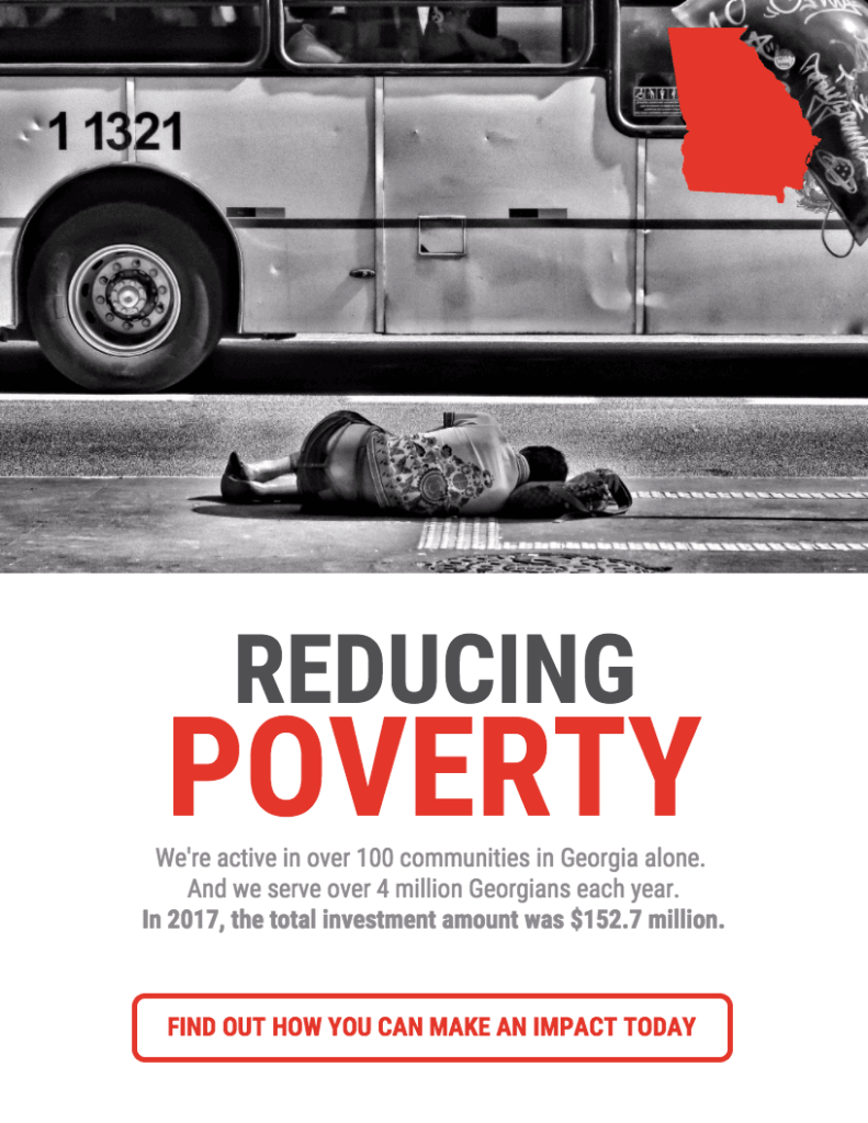
As you can see in the example, the simple infographic is minimalist yet impactful. It uses a strong image to convey the problem, along with a large headline. The body copy is also minimal, relying on key statistics to get the message across.
The infographic is completed with a bold call to action. When used as a newsletter or website graphic, the call to action can be made clickable.
Share on social media, or as a poster, a link or phone number can be included under the call to action to motivate donors to perform an action.
The simple infographic is versatile in the variety of ways it can be used, and it is far more impactful than the name implies.
4. List Infographics
Lists have been becoming more popular in content marketing in the last few years. Almost every website or blog shares listicle content (including this article).
Anyone who has read a listicle knows that they are easier to read than blocks of text. Lists automatically break content into sections, which is great for readability.
List infographics leverage the simplicity and readability of listicles while making them more visually attractive, and more shareable.
You can see in the list infographic example below how simple it is to put together, and how easy it is for a donor to read.
While this infographic uses numbers to list the items in the visual, it isn’t always necessary to be so obvious with your list. You can use a different layout where numbers are not required.
Even in this list, the use of icons in place of the numbers would have worked to mark out the different sections.
Whether or not you want to use numbers is up to your discretion. The great thing about using templates is that you have the option to swap the numbers out for icons or shapes.
The list infographic is a simple layout that conveys information succinctly, while also being adaptable enough for you to customize it to your needs.
5. Icon Infographics
When people think of visuals, they often imagine pictures and illustrations. But icons are a powerful visual that should not be discounted.
Icons are less open to interpretation than other visuals and have universal appeal. They’re similar to the modern version of hieroglyphs and are parallel to emojis in their appeal.
Using icons in your data visualization, whether in infographics or charts, ensures that you are able to communicate your message without being wordy.
The below infographic is a good example of how icons can be used as an effective communication tool.
You will notice in the icon infographic above that each icon is labeled. This is an important note to keep in mind when using icons.
Though icons are usually self-explanatory, it is always best to label icons as it makes it easier for the reader to understand the context of the icon being used in the visual.
It is also important to keep the size and color of icons in the infographic consistent. Inconsistent icons will distract the readers from the message of your infographic.
This icon infographic has a large amount of information to share—but not all icon infographics need to be this long. You can also expand the text you use with the icons in this style of an infographic.
An icon infographic is a great way to share numerous points in one visual. You can also use the icon infographic to point donors to more information on a website or blog post, which will boost web traffic and engagement.
Conclusion
Infographics are a powerful communication tool for nonprofits to share information and encourage donors to act.
And there are plenty of options for nonprofits when they use tools like Venngage to create infographics. The customizable options that infographic templates offer make them an ideal tool for reaching new audiences and attracting donors.
With the right infographics, your nonprofit marketing will soon be attracting more donors than before.
All images are sourced from Venngage.
Ronita Mohan
 Ronita Mohan is a content marketer at Venngage, the online infographic and design platform. Ronita is interested in a variety of topics related to digital marketing, visual content, and online engagement, which she enjoys researching and writing about.
Twitter: @Venngage