Nonprofits must use their resources wisely and effectively to remain in operation. Doing that requires seeing which programs have the biggest payoffs and comparing the outcomes versus the staff members and monetary resources used. Since nonprofits often have smaller teams and tighter budgets than corporate enterprises, they must continually measure impact against the resources used.
You may think that sounds difficult, and indeed, it can be tricky. However, a matrix map can make the task substantially more straightforward. Matrix maps can help nonprofits by showing how and where the organization has an impact.
What Is a Matrix Map?
The simplest way to describe a matrix map is as a visual aid that shows the link between an organization’s activities and its profitability. It allows board members or other stakeholders to see at a glance how the nonprofit spreads its resources, and what happens when programs receive funding.
The three main parts of a matrix map are:
- A horizontal axis
- A vertical axis
- Colored circles of various sizes
A Breakdown of the Matrix Map Components
The horizontal axis shows the profitability. There’s a zero in the center of the line, and then red numbers on the left and black ones to the right. A program goes to the left side of the axis if it lost money, and it sits on the right when it helps an organization make a profit.
Source:https://nonprofitquarterly.org/the-matrix-map-a-powerful-tool-for-mission-focused-nonprofits/
The increments of each entry on the horizontal axis vary depending on how much money must be tracked. One simple method they use is to make the profit increments surrounding the zero go up or down by $5,000 or $10,000 at each point along the axis.
So, if using the $5,000 increment:
- – $10,000
- -$5,000
- 0
- +5,000
- +$10,000
The vertical axis represents the impact of each program or cause listed on the matrix map.
Gauging this is not as straightforward as calculating the profitability. That’s because it differs for each organization.
Some ways a nonprofit might measure impact include:
- The number of people affected
- The amount a program contributes to community enrichment
- How closely an effort aligns with an organization’s mission statement
- The extent to which the organization fills a previously unmet need
- The number or kind of partnerships created because of a program
The vertical axis should have numbers along with it. The lowest point would have a zero, with the highest point designated with a five, for example.
Next, it’s time to create colored circles for each one of a nonprofit’s programs or lines of business.
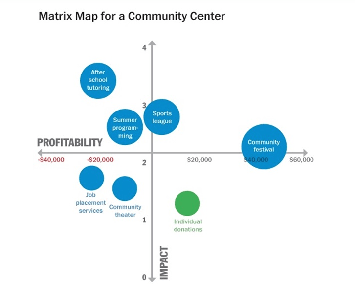
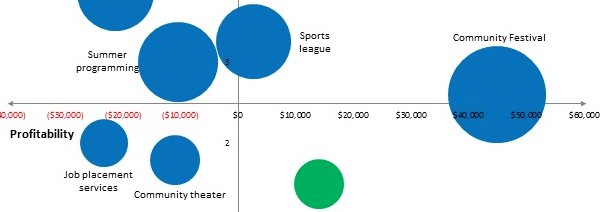
While the graphic above is for a community center, let’s look at another kind of organization and the services it provides. Take the example of a domestic violence refuge, which may offer:
- Residential service for abuse victims
- Drop-in counseling
- 24-hour helpline
- Childcare service for refuge users
- Court accompaniment service
- High school program that teaches differences between healthy and unhealthy relationships
- Community charity shop
Then, there are circles indicating each activity or service provided by a nonprofit. The ones at the higher ends of the profitability or impact lines are what some people see as the most successful for that organization. Moreover, putting a larger circle on the map indicates that the program or business line is particularly profitable or impactful relative to others.
Here’s an example of a completed matrix map for a community organization that runs job training programs for underemployed populations:
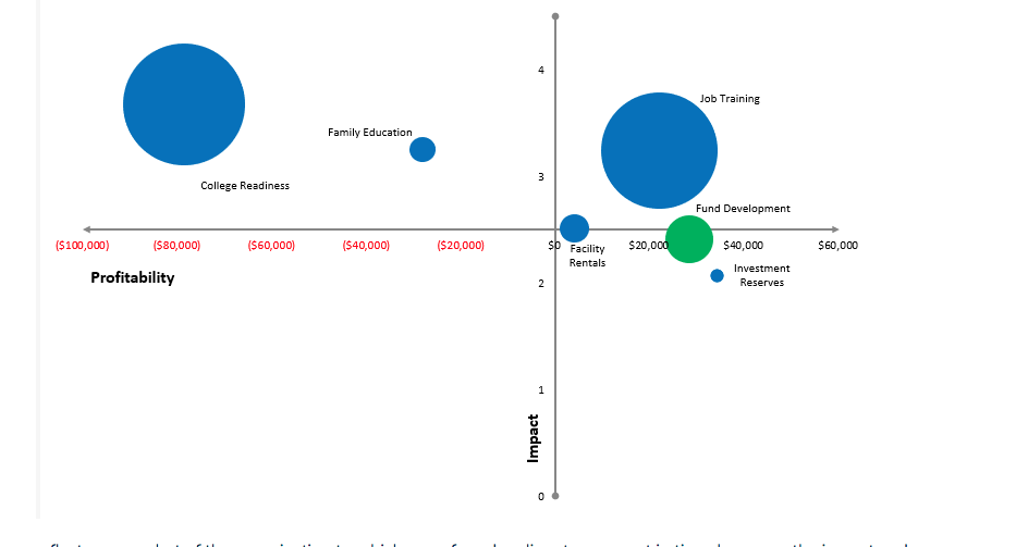
Source: https://spectrumnonprofit.com/market-analysis-matrix-map/
Concerning the color scheme, nonprofits can keep things simple. For example, they might have red circles for all the things that cost the organization money to run but use a green hue to represent donations. Also, remember that some programs could be somewhat costly to operate but are profitable, too.
Let’s go back to the list above for the domestic violence refuge’s programs. The community charity shop might have some associated expenses, such as the cost to rent a space, hire help, or purchase supplies like receipt tape and shopping bags. However, consider a scenario where people in the area donate their unwanted clothes or other items to the store, with all proceeds going directly back to the refuge.
In that instance, as well as any others that require expenditures but derive significant donations, you might have them in a distinctly different color, like orange. Then, it becomes easier to visually separate those activities from the ones that are mostly resource-dependent versus primarily donation-based.
Why Do Matrix Maps Help Nonprofits?
Besides the visibility matrix maps provide, what other benefits do they give nonprofits? For starters, they:
- Give people a renewed appreciation for how everyone contributes to an organization
- Let board members see how people have to work together
- Help an organization’s members thrive by providing an easily understandable visual aid
- Show the relative number of programs that break even or lose money
- Save people from making misinformed assumptions about program costs
- Enable nonprofits to quickly spot the programs that fail to justify the expenses
- Kickstart progress in identifying what changes will boost impact
How Do Matrix Maps Bring Clarity to an Organization’s Data?
One of the reasons why visual aids like matrix maps are so valuable for businesses is that they make it easier to distinguish the outliers from overall patterns within the information. Business leaders often use data visualizations to guide their decision-making processes. Interpreting the information in a new way allows them to see trends they’d otherwise miss.
The increased clarity brought about by a matrix map can also make a nonprofit realize it’s time to cut a struggling program and focus on something else. Organizations can then make the tough but necessary decisions they’ve been putting off for too long. Even better, matrix maps help them feel confident about reaching those conclusions.
How to Design and Use Your Matrix Map
The earlier section explained the primary parts of a matrix map. Nonprofits need that information, but they also need practical tips that help them make well-designed and effective. The first essential step is to list all your business lines or programs. Also, don’t overlook a major fundraising drive, such as an annual gala. It should be one of the business lines.
As mentioned earlier, defining and measuring the impact is challenging. That’s mainly because the definition of impact differs in each nonprofit. That said, it’s ideal to have two of the same criteria in every case:
- The contribution to the intended impact: How well does this particular program/business line achieve the overall mission of the organization?
- Excellence in execution: Does our organization have the skills and resources to deliver this program/business line with consistently high quality?
Besides those aspects, you only need to choose two others that help your organization calculate impact.
Calculating the Mission Impact Score
After the participants narrow down the four kinds of impact, a nonprofit determines the mission impact score by figuring out the average. Remember that this is a numerical value between one and five. You can also use the same number for more than one impact area.
Let’s go back to the theoretical women’s refuge example and look at how it could reach a mission impact score:
- The contribution to the intended impact: 4
- Excellence in execution: 3
- Meets a significant unmet need: 3
- Helps leverage external and internal relationships: 2
Then, to calculate the average, add all the impact values together, and divide the sum by the number of impact types. In this case, the total of the impact values is 12, and you’re dividing that number by four to come up with your mission impact score of three.
Investigating the Types of Expenses That Factor Into Profits or Losses
When designing and using the matrix map, you create a mission impact score using the formula above for all your programs. Also, indicate the profitability or losses along with each impact score. A nonprofit could have a three-column chart that shows:
- The program/business line name or type
- Profitability or loss
- Mission impact score
When evaluating profitability or lack thereof, look at three areas:
- Direct costs: The expenses that go solely toward making that single program happen
- Shared costs: Any expenses that relate to this program, as well as at least one other
- Administrative or indirect costs: These are the expenses nonprofit bears to function, such as employee salaries, office supplies and monthly rent or utility bills
Together, these components make up the true costs for a given program. Nonprofits should not try to calculate profitability without figuring out the true costs first.
Converting the Data Into a Chart
Once a nonprofit gathers all the information above, it can use Excel to make a chart. The most appropriate Excel chart style for a matrix map is the bubble chart. It turns the data into the corresponding circles discussed earlier.
Once everyone has a chance to see the data in its visual format, some pointed questions might help stimulate further discussions. They may include:
- Is our funding stream generally stable or fluctuating? How much control do we have over it, and could we do things to increase our influence?
- Are the programs that require the most resources also most closely aligned with our organizational mission?
- If we eliminate low-impact programs or reduce the resources put toward them, how would other things benefit from the change?
- Are there other local nonprofits that have programs similar to our lowest-impact ones? If so, should we cease offering ours and put the resources elsewhere?
Another Resource for Matrix Map Creation and Analysis
Steve Zimmerman is an authority on creating matrix maps. His book, “The Sustainability Mindset,” co-authored with Jeanne Bell, is a reliable resource for nonprofits to check out as they dive into the process of creating matrix maps that help them measure impact. When Zimmerman spoke at a 2015 conference, he brought up six questions to assist organizations in gauging impact with their matrix maps. They were:
- What do your constituents need?
- How do you define impact?
- How does each of your programs contribute to impact?
- What are the true costs of your programs?
- Which other entities are serving in your space?
- Have you fully invested in your success?
Most of these questions relate to things already covered above, but their brevity could help organizations focus while making their matrix maps. The queries could be especially helpful for remaining productive if these maps are new to most people in the room.
Matrix Maps Promote Nonprofit Success
This detailed guide will help nonprofits learn how to create matrix maps, as well as explain to those organizations why they’re so useful.
The goal is for a nonprofit’s programs to be highly profitable and impactful. However, it’s not always easy for an organization to know for sure which programs come closest to meeting those ideal characteristics. Some rely too much on assumptions and educated guesses, or they might keep pouring resources into a program because it’s one of the oldest they have.
Matrix maps can help nonprofits confirm which of their offerings have the desired effects and which might need retooling or discontinuation. As such, they’re useful regardless of the size, type or age of a nonprofit. They can give visibility that pushes an organization to make choices that keep it viable.