A nonprofit marketing campaign is only as good as its landing page. A landing page, or the page where donors “land” when they click on a link to learn more about your campaign, can make or break your fundraising strategy – no matter how noble your cause is.
Arriving the Tuesday after Thanksgiving in the U.S., Giving Tuesday serves as the kick-off to the end-of-year giving season and is a vital opportunity to boost your annual fundraising. This global day of giving is one of the most important days on any fundraiser’s calendar!
Giving Tuesday will take place on November 28 in 2023. So it’s essential to design an effective Giving Tuesday landing page with everything your donors need to learn about and support your mission.
In this article, we will give you some tips on how to design a Giving Tuesday landing page that will take your campaign to the next level!
What is a Giving Tuesday Landing Page?
Landing pages are the pages where people interested in your campaign end up after clicking a link on your website, email, marketing materials, donate button, or social media.
Because landing pages are where donors will “land” for your Giving Tuesday campaign, it’s vital that they are in tip-top shape. The best Giving Tuesday landing page – also known as Giving Tuesday donation pages – will also include a quick and easy way to give to your campaign. They are a critical part of your Giving Tuesday toolkit because, without them, your donors won’t have anywhere to go to support your campaign.
There are several landing page best practices to follow, like keeping your landing page copy succinct, sharing eye-catching visuals, linking to social media, and more. These tips will help you design the best possible Giving Tuesday landing page to drive more donations for your campaign – and start building lasting relationships with your donors!
7 Tips to Design a Giving Tuesday Landing Page
In this section, we’ll share some tips on how you can create effective landing pages to get more donations
By following some of these steps, you can make the most out of your Giving Tuesday initiative.
Tip #1: Craft a Headline that Says it All
The first thing potential donors read on your donation page is your headline. Your landing page headline must clearly convey your message without having to spell it out.
It should be clear, concise, and specific. The headline will be the first thing your visitors will notice (aside from images, but you’ll learn more about that later).
What you need to do:
- Demonstrate urgency by adding words like “today” and “right now” (e.g. Join Our Cause Right Now) – more on this later
- Show donors how they can impact your cause (e.g. Your Donations Bring More Kids the Education They Need )
- Directly involve and engage the audience (e.g. Kids with Disabilities in Haiti Need Our Help)
Pro tip: Sharing a statistic is another great way to capture attention and get people to join your cause (e.g. 24 Million Children Don’t Have the Privilege of Attending School, and We Can Change That).
Aside from writing a compelling headline, you should also focus on how you deliver the line. A perfectly crafted landing page headline will impact donors better if you use a legible font next to a related image.
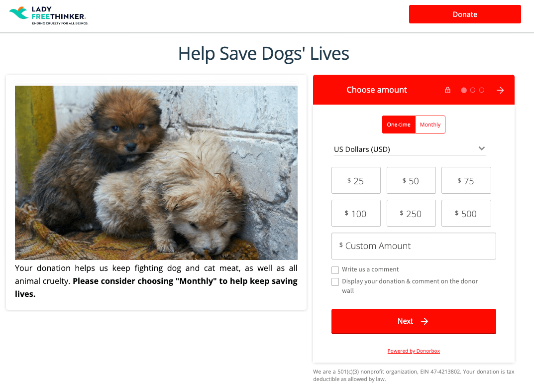
Here is an example of a headline that really appeals to people. On their landing page, Lady Freethinker uses their headline, “Help Save Dogs’ Lives” to immediately connect with donors. This is an urgent headline that demonstrates the real-world value of donations.

Get Started With Donorbox
Tip #2: Give a Clear Reason for Donating – and Donating Now
The best Giving Tuesday landing pages offer a clear, concise reason to give TODAY.
Getting people to notice your landing page is one thing, but you also need to convince them that their gift matters. And that you can’t wait to receive their help.
After your headline, your introduction paragraph is the most crucial. This should answer all your donors’ questions. In this section, introduce your mission and share engaging and inspiring stories that will move people. Here are a few tips to increase your donors’ excitement:
- Write a short paragraph that introduces the cause.
- Include background information and context, as well as quotes, if possible.
- Let supporters know what happens if they make a donation to your mission.
What drives people to donate on your landing page is knowing how a donation can impact a specific beneficiary or cause. Make sure this is clearly stated using direct, yet powerful, language.
And, to get your donors to give today, on Giving Tuesday, ensure you establish a sense of urgency. This can be done within the content – sharing why your beneficiaries need help now – as well as with tools such as a goal meter. A goal meter, or goal thermometer, displays how much you have already raised (another form of social proof, which we talk about later) as well as how much more funding is needed.
Pro tip: Goal meters are a hallmark of crowdfunding pages, a type of landing page that is ideal for Giving Tuesday campaigns. This is thanks to tools such as these goal meters as well as donor walls, social sharing buttons, the ability to add updates, and more. Learn more about creating effective crowdfunding pages here.
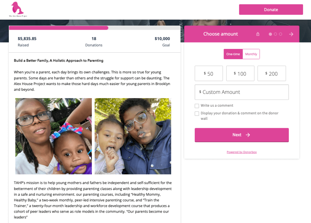
We love how The Alex House Project succinctly sums up the problem and their solution – aka, how donors can help – all in the first paragraph on their landing page. Then they show two heartwarming pictures of the people they support before diving into the nitty gritty of their mission. Plus, they use a goal meter to show how far they have to go to reach their fundraising goal!
Tip #3: Create User-Friendly Donation Forms
Some people hesitate to donate on landing pages because of the long forms they need to fill out. Best practices say your donation form should be short and limited to just a name, email address, and an option to donate anonymously.
You should also display different ask amounts in regular intervals. Even so, not everyone who wants to help can afford your smallest ask amount – or they may want to give more – so also add custom donation options. Providing varied options allows donors of all sizes to feel welcomed and like they’re able to make a difference.
With Donorbox donation forms, you can fully customize the form so you collect any donor information you need. You can also choose colors to match your branding and enable features like UltraSwift™ Pay to make the checkout process four times faster.
Plus, demonstrate the impact of each giving tier by illustrating what each amount does for the causes you help.
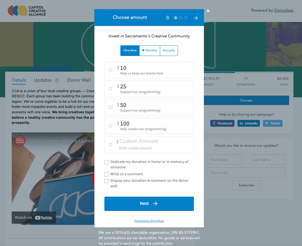
Check out how Capitol Creative Alliance added a dynamic pop-up donation form to their Giving Tuesday landing page. For each donation level, they explained what that amount does to help them with their mission.

Set Up Your Donation Form Today
Tip #4: Optimize the Page for Mobile
Most people browse the Internet on their phones, and some landing pages are not smartphone-friendly. When you don’t optimize your website for mobile, it can drive away potential donors.
Some forms are also hard to fill out using a phone, which is why you should make sure your giving form is designed for desktops, tablets, and smartphones.
There are several landing page builders that give you the option to preview how a website would look on mobile. These page builders also allow you to add elements such as donation buttons for quick and easy payment options that would make it easier for people to donate using credit cards and other payment platforms.
All Donorbox donation pages and donation forms are mobile-friendly, so you never have to worry about how your landing page and giving form will look on a mobile device. Plus, donors can check out using their digital wallets – meaning they don’t have to enter their contact or payment info – which makes mobile giving even easier.
Tip #5: Incorporate Visuals
Make sure your landing page is not all text. Visuals often speak louder than words, so make your landing page extra engaging by incorporating pictures and videos
Visuals on landing pages get attention, drive engagement, educate people about your cause, and – most importantly – drive donations.
Here are a few ways you can incorporate visuals:
- Use images of the people, places, or animals that will benefit from your Giving Tuesday fundraising. Additionally, you can share video testimonials from those you have impacted in the past.
- Create videos explaining your cause to both educate and appeal to the emotions of your audience.
- Create roadmaps and illustrations that will clearly outline how donations help those you serve.
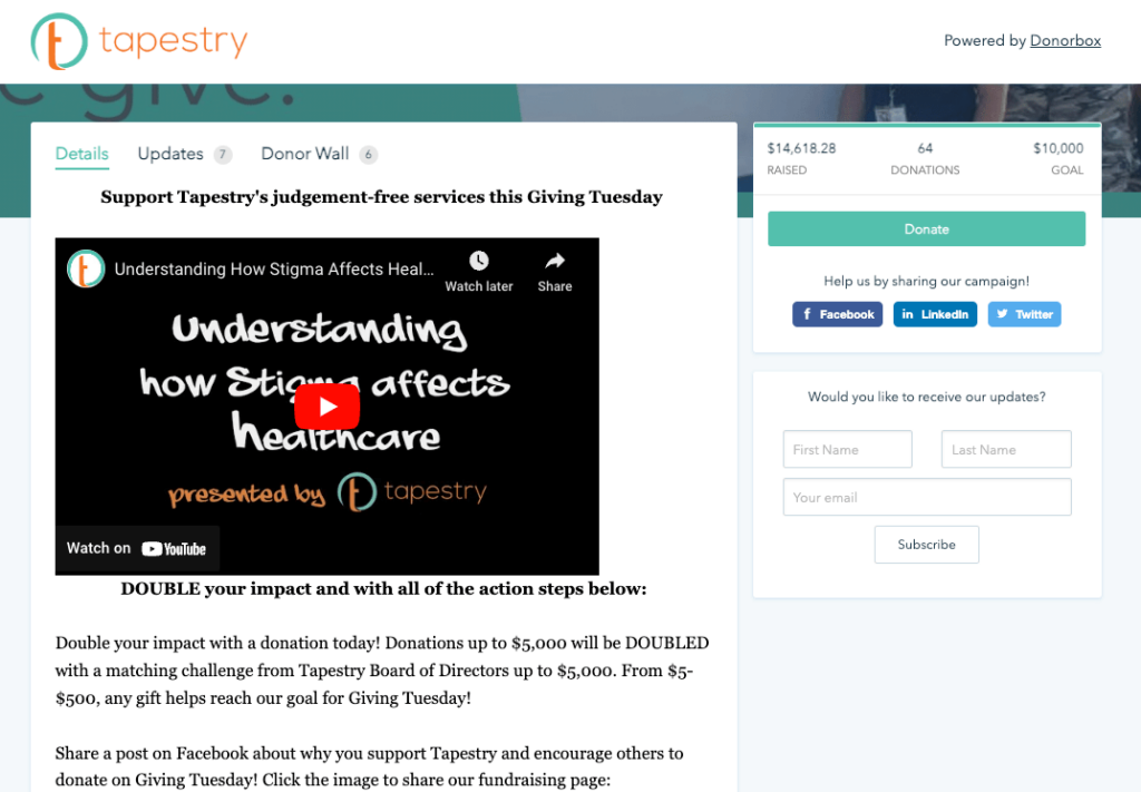
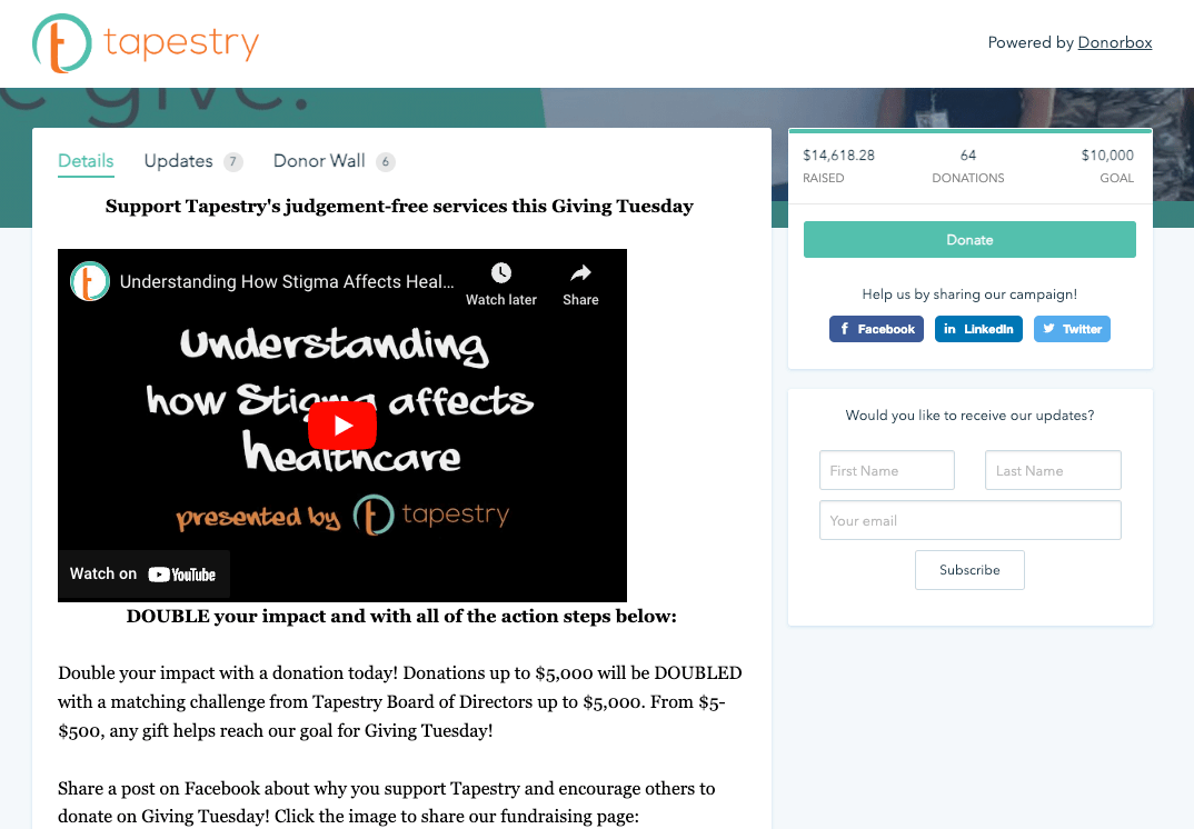
Tapestry shares a compelling video that both educates about the problem they’re addressing and connects with their donors’ emotions.
Tip #6: – Tell a Story
Ah, storytelling – a nonprofit fundraiser’s ultimate tool.
Stories are how we process our world, connect with each other, and share our deepest truths. Telling a story on your Giving Tuesday landing page will connect with donors. It also helps demonstrate the urgency and need behind your mission. But, it can sometimes feel daunting to get started.
We have several resources to help you tell the perfect fundraising story on your landing page. You can tell a story through text, video, pictures, or some combination of all three. Weave your story throughout your landing page so donors know more about what you actually do and how it positively affects others.
Tip #7: – Use Social Proof
Social proof describes how people are more likely to do something if they see other people doing it. This influences everything from our fashion choices to our philanthropy.
A great way to encourage more donations through your Giving Tuesday landing page is to use social proof. Demonstrating how others have supported your organization encourages like-minded donors to give (or give more).
Simply placing a donor wall on your landing page is an excellent method to add social proof to your campaign. A donor wall showcases recent donors’ names and comments (with their permission). It’s also an excellent way to show off your donors and immediately acknowledge them.
You can easily add a donor wall to your Donorbox landing page or even embed one on your website.
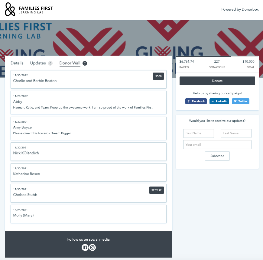
Families First used a donor wall on their Giving Tuesday crowdfunding page to showcase some of their donors and encourage more donations.

[maxbutton id=”1″ url=”donorbox.org/orgs/new/” text=”Add a Donor Wall to Your Landing Page”
Conclusion
Giving Tuesday landing pages should connect with your donors in a more engaging, exciting way. Through strategic text, detailed storytelling, and compelling videos and images, as well as powerful software tools running behind the scenes, Giving Tuesday 2023 can be your most successful yet!
Before you start creating your landing page, there is one more tip you need to know and that is to be true to your cause. As long as you believe in your cause, more people will follow.
Donorbox is here to help! With sleek, mobile-friendly donation forms and donation pages, features like crowdfunding and peer-to-peer, in-person giving with the Donorbox Live™ Kiosk app, and streamlined event ticketing, we can help you make the most out of the 2023 giving season.
For more fundraising tips and know-how, check out the rest of our Nonprofit Blog.


